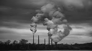
Mathematicians Have Finally Proved That Bach was a Great Composer

Converting hundreds of compositions by Johann Sebastian Bach into mathematical networks reveals that they store lots of information and convey it very effectively.

Johann Sebastian Bach is considered one of the great composers of Western classical music. Now, researchers are trying to figure out why – by analysing his music with information theory.

Suman Kulkarni at the University of Pennsylvania and her colleagues wanted to understand how the ability to recall or anticipate a piece of music relates to its structure. They chose to analyse Bach’s opus because he produced an enormous number of pieces with many different structures, including religious hymns called chorales and fast-paced, virtuosic toccatas.

First, the researchers translated each composition into an information network by representing each note as a node and each transition between notes as an edge, connecting them. Using this network, they compared the quantity of information in each composition. Toccatas, which were meant to entertain and surprise, contained more information than chorales, which were composed for more meditative settings like churches.

Kulkarni and her colleagues also used information networks to compare Bach’s music with listeners’ perception of it. They started with an existing computer model based on experiments in which participants reacted to a sequence of images on a screen. The researchers then measured how surprising an element of the sequence was. They adapted information networks based on this model to the music, with the links between each node representing how probable a listener thought it would be for two connected notes to play successively – or how surprised they would be if that happened. Because humans do not learn information perfectly, networks showing people’s presumed note changes for a composition rarely line up exactly with the network based directly on that composition. Researchers can then quantify that mismatch.

In this case, the mismatch was low, suggesting Bach’s pieces convey information rather effectively. However, Kulkarni hopes to fine-tune the computer model of human perception to better match real brain scans of people listening to the music.

“There is a missing link in neuroscience between complicated structures like music and how our brains respond to it, beyond just knowing the frequencies [of sounds]. This work could provide some nice inroads into that,” says Randy McIntosh at Simon Fraser University in Canada. However, there are many more factors that affect how someone perceives music – for example, how long a person listens to a piece and whether or not they have musical training. These still need to be accounted for, he says.

Information theory also has yet to reveal whether Bach’s composition style was exceptional compared with other types of music. McIntosh says his past work found some general similarities between musicians as different from Bach as the rock guitarist Eddie Van Halen, but more detailed analyses are needed.

“I would love to perform the same analysis for different composers and non-Western music,” says Kulkarni.

For more such insights, log into www.international-maths-challenge.com.

*Credit for article given to Karmela Padavic-Callaghan*


Swarming cicadas, stock traders, and the wisdom of the crowd

The springtime emergence of vast swarms of cicadas can be explained by a mathematical model of collective decision-making that has similarities to models describing stock market crashes.

Pick almost any location in the eastern United States—say, Columbus Ohio. Every 13 or 17 years, as the soil warms in springtime, vast swarms of cicadas emerge from their underground burrows singing their deafening song, take flight and mate, producing offspring for the next cycle.

This noisy phenomenon repeats all over the eastern and southeastern U.S. as 17 distinct broods emerge in staggered years. In spring 2024, billions of cicadas are expected as two different broods—one that appears every 13 years and another that appears every 17 years—emerge simultaneously.

Previous research has suggested that cicadas emerge once the soil temperature reaches 18°C, but even within a small geographical area, differences in sun exposure, foliage cover or humidity can lead to variations in temperature.

Now, in a paper published in the journal Physical Review E, researchers from the University of Cambridge have discovered how such synchronous cicada swarms can emerge despite these temperature differences.

The researchers developed a mathematical model for decision-making in an environment with variations in temperature and found that communication between cicada nymphs allows the group to come to a consensus about the local average temperature that then leads to large-scale swarms. The model is closely related to one that has been used to describe “avalanches” in decision-making like those among stock market traders, leading to crashes.

Mathematicians have been captivated by the appearance of 17- and 13-year cycles in various species of cicadas, and have previously developed mathematical models that showed how the appearance of such large prime numbers is a consequence of evolutionary pressures to avoid predation. However, the mechanism by which swarms emerge coherently in a given year has not been understood.

In developing their model, the Cambridge team was inspired by previous research on decision-making that represents each member of a group by a “spin” like that in a magnet, but instead of pointing up or down, the two states represent the decision to “remain” or “emerge.”

The local temperature experienced by the cicadas is then like a magnetic field that tends to align the spins and varies slowly from place to place on the scale of hundreds of meters, from sunny hilltops to shaded valleys in a forest. Communication between nearby nymphs is represented by an interaction between the spins that leads to local agreement of neighbours.

The researchers showed that in the presence of such interactions the swarms are large and space-filling, involving every member of the population in a range of local temperature environments, unlike the case without communication in which every nymph is on its own, responding to every subtle variation in microclimate.

The research was carried out Professor Raymond E Goldstein, the Alan Turing Professor of Complex Physical Systems in the Department of Applied Mathematics and Theoretical Physics (DAMTP), Professor Robert L Jack of DAMTP and the Yusuf Hamied Department of Chemistry, and Dr. Adriana I Pesci, a Senior Research Associate in DAMTP.

“As an applied mathematician, there is nothing more interesting than finding a model capable of explaining the behaviour of living beings, even in the simplest of cases,” said Pesci.

The researchers say that while their model does not require any particular means of communication between underground nymphs, acoustical signaling is a likely candidate, given the ear-splitting sounds that the swarms make once they emerge from underground.

The researchers hope that their conjecture regarding the role of communication will stimulate field research to test the hypothesis.

“If our conjecture that communication between nymphs plays a role in swarm emergence is confirmed, it would provide a striking example of how Darwinian evolution can act for the benefit of the group, not just the individual,” said Goldstein.

For more such insights, log into our website https://international-maths-challenge.com

Credit of the article given to Sarah Collins, University of Cambridge


Researchers use simulations to tackle finite sphere-packing problem and ‘sausage catastrophe’

Have you ever wondered about the best way to pack a finite number of identical spheres into a shape-shifting flexible container, like a convex hull?

Researchers from the University of Twente, Active Soft Matter Lab led by Dr. Hanumantha Rao Vutukuri in the TNW Faculty, along with Utrecht University, have investigated this fascinating mathematical sphere-packing problem by combining experiments and computer simulations. Their research has been published in Nature Communications.

An intuitively simple problem concerning the best way to pack a set of spheres has a long history of studies dating back to the 17th century. The British sailor Raleigh, for instance, contemplated this issue while trying to find an efficient method for stacking cannonballs on his ship.

Later, Kepler conjectured that the densest packing for an infinite number of spheres would be the face-centered cubic (FCC) crystal structure, akin to the hexagonal arrangement of oranges and apples seen in supermarkets. Remarkably, this hypothesis was only proven in the 21st century.

The ‘sausage catastrophe’

When you have a finite number of spheres, everything gets more complicated; surprisingly, packing the “finite” spheres in a compact cluster does not always yield the densest packing. Mathematicians already conjectured decades ago that a linear, sausage-like arrangement provides the best packing, however, not for all numbers of spheres.

There’s a peculiar phenomenon at play: The sausage-shaped arrangement is the most efficient packing, but only with up to 55 spheres. Beyond that number, a clustered arrangement becomes the best packing. This abrupt transition is known as the “sausage catastrophe.”

In three-dimensional space, packing up to 55 spheres linearly forms a “sausage” that is denser than any cluster arrangement. However, in four dimensions, this scenario changes dramatically. About 300,000 spheres are needed for the “sausage” to transform into a spherelike cluster.

Rao was curious about whether this fundamentally intriguing problem could be observed and resolved in the lab using a model system. This system includes micron-sized spherical particles (colloids) and giant unilamellar vesicles (GUVs), which serve as flexible containers that are the main ingredients in Vutukuri’s lab.

“This curiosity led us to explore the finite sphere packing problem through experiments in 3D real space, specifically using colloids in GUVs. By varying the number of particles and the volume of the vesicles, we were able to examine the different particle arrangements inside these vesicles using a confocal microscope.

“We identified stable arrangements for specific combinations of vesicle volume and particle number: 1D (sausage), 2D (plate, with particles in one plane), and 3D (cluster). Notably, we also observed bistability; the configurations alternated between 1D and 2D arrangements or between 2D and 3D structures. However, our experiments were limited to observing a maximum of nine particles, as packing a larger number of particles resulted in the rupture of the vesicles.”

Vutukuri says that they then contacted Dijkstra’s lab at Utrecht University to delve deeper into this problem using simulations. Strikingly, the simulations predicted that packing spheres in a sausage configuration is most efficient for up to 55 spheres. However, when they attempted to pack 56 spheres into a vesicle, they discovered that a compact three-dimensional cluster was the more efficient arrangement.

Remarkably, for 57 spheres, the packing reverted back to a sausage configuration. While mathematicians have previously determined that a sausage configuration is the most efficient for 58 and 64 spheres, their study contradicts this, demonstrating that compact clusters are more effective.

The findings show that the “sausage catastrophe,” a phenomenon previously described by mathematicians, is not just a theoretical scenario but can also be observed experimentally.

For more such insights, log into our website https://international-maths-challenge.com

Credit of the article given to University of Twente


New methods to improve the accuracy of cross-national surveys

Research by Social Statistics has highlighted new methods to improve the accuracy of cross-national surveys. Cross-national surveys run the risk of differential survey errors, where data collected vary in quality from country to country. The study is published in the Journal of Survey Statistics and Methodology.

Responsive and adaptive survey designs (RASDs) have been proposed as a way to reduce survey errors, by leveraging auxiliary variables to inform fieldwork efforts, but have rarely been considered in the context of cross-national surveys.

Using data from the European Social Survey, Dr. Alex Cernat, Dr. Hafsteinn Einarsson and Professor Natalie Shlomo from Social Statistics simulate fieldwork in a repeated cross-national survey using RASD where fieldwork efforts are ended early for selected units in the final stage of data collection.

Demographic variables, paradata (interviewer observations), and contact data are used to inform fieldwork efforts.

Eight combinations of response propensity models and selection mechanisms are evaluated in terms of sample composition (as measured by the coefficient of variation of response propensities), response rates, number of contact attempts saved, and effects on estimates of target variables in the survey.

The researchers find that sample balance can be improved in many country-round combinations. Response rates can be increased marginally and targeting high propensity respondents could lead to significant cost savings associated with making fewer contact attempts.

Estimates of target variables are not changed by the case prioritizations used in the simulations, indicating that they do not impact non-response bias.

They conclude that RASDs should be considered in cross-national surveys, but that more work is needed to identify suitable covariates to inform fieldwork efforts.

For more such insights, log into our website https://international-maths-challenge.com

Credit of the article given to University of Manchester


Developing task design principles to foster students’ recognition of relativity of truth in math education

Although a typical mathematical task has a single correct answer, in some cases, the assumptions of a proposition determine its truth. Such relativity of truth plays a major role in the development of mathematics.

Furthermore, in our daily lives, we must identify assumptions that underlie each other’s discussions and clarify such assumptions for better communication. Hence, students’ recognition of the relativity of truth involving assumptions must be developed; however, how to encourage such development in primary and secondary education remains unclear.

To address this issue, the researchers have developed principles that support the design of mathematics tasks. Contrary to typical mathematical tasks, the researchers introduced an innovation in which the conditions of tasks are intentionally made ambiguous, directing students’ attention to the task assumptions.

The study is published in Cognition and Instruction.

The researchers collaborated with primary and secondary school teachers to implement research cycles, each of which composed of designing a mathematical task, implementing it in one or more classrooms, and evaluating such implementation. Based on these research cycles, they developed task design principles, which involved creating a task open to different legitimate assumptions and conclusions by intentionally leaving some of the task’s assumptions implicit or unspecified, and demonstrated the effectiveness of these principles.

The task design principles developed in this study allow teachers to design relevant tasks independently and implement them in their classrooms, which would foster their students’ recognition of the relativity of truth in different circumstances.

For more such insights, log into our website https://international-maths-challenge.com

Credit of the article given to University of Tsukuba


Are We All Related To Henry VIII’s Master Of The Mint?

After discovering that a Ralph Rowlett was in charge of the Royal Mint in 1540, Peter Rowlett runs the genealogy calculations to find out if he could be related.

In 1540, Henry VIII’s coins were made in the Tower of London. One of the Masters of the Mint was Ralph Rowlett, a goldsmith from St Albans with six children. I wondered: am I descended from Ralph? My Rowlett ancestors were Sheffield steelworkers, ever since my three-times great grandfather moved north in search of work. The trail goes cold in a line of Bedfordshire farm labourers in the 18th century, offering no evidence of a direct relationship.

My instincts as a mathematician led me to investigate this in a more mathematical way. I have two parents. They each have two parents, so I have four grandparents. So, I have eight great-grandparents, 16 great-great-grandparents and 2n ancestors n generations ago. This exponential growth doubles each generation and takes 20 generations to reach a million ancestors.

Ralph lived 20 to 25 generations before me in an England of about 2 million people. The exponential growth argument says I have several million ancestors in his generation, so, because we run out of people otherwise, he is one of them.

But this model is based on the assumption that everyone is equally likely to reproduce with anyone else. In reality, especially at certain points in history, people were likely to reproduce with someone from the same geographic area and demographic group as themselves.

But I am not sure this makes a huge difference here because we are dealing with something called a small-world network: most people are in highly clustered groups, tending to pair up with nearby people, but a small number are connected over greater distances. An illegitimate child of a nobleman would have a different social class to their father. A migrant seeking work could reproduce in a different geographic area.

We don’t need many of these more remote connections to allow a great amount of spread around the network. This is the origin of the six degrees of separation concept – that you can link two people through a surprisingly short chain of friend-of-a-friend relationships.

I ran a simulation with 15 towns of a thousand people, where everyone has only a 5 per cent chance of moving to another town to reproduce. It took about 20 generations for everyone to be descended from a specific person in the first generation. I ran the same simulation with 15,000 people living in one town, and the spread took about 18 generations. So the 15-town structure slowed the spread, but only slightly.

What does this mean for Ralph and me? There is a very good chance we are related, whether through Rowletts or another route. And if you have recent ancestors from England, there is a good chance you are too.

For more such insights, log into www.international-maths-challenge.com.

*Credit for article given to Peter Rowlett*


Here’s why you should (almost) never use a pie chart for your data

Our lives are becoming increasingly data driven. Our phones monitor our time and internet usage and online surveys discern our opinions and likes. These data harvests are used for telling us how well we’ve slept or what we might like to buy.

Numbers are becoming more important for everyday life, yet people’s numerical skills are falling behind. For example, the percentage of Year 12 schoolchildren in Australia taking higher and intermediate mathematics has been declining for decades.

To help the average person understand big data and numbers, we often use visual summaries, such as pie charts. But while non-numerate folk will avoid numbers, most numerate folk will avoid pie charts. Here’s why.

What is a pie chart?

A pie chart is a circular diagram that represents numerical percentages. The circle is divided into slices, with the size of each slice proportional to the category it represents. It is named because it resembles a sliced pie and can be “served” in many different ways.

An example pie chart below shows Australia’s two-party preferred vote before the last election, with Labor on 55% and the the Coalition on 45%. The two near semi-circles show the relatively tight race—this is a useful example of a pie chart.

What’s wrong with pie charts?

Once we have more than two categories, pie charts can easily misrepresent percentages and become hard to read.

The three charts below are a good example—it is very hard to work out which of the five areas is the largest. The pie chart’s circularity means the areas lack a common reference point.

Pie charts also do badly when there are lots of categories. For example, this chart from a study on data sources used for COVID data visualization shows hundreds of categories in one pie.

The tiny slices, lack of clear labeling and the kaleidoscope of colors make interpretation difficult for anyone.

It’s even harder for a color blind person. For example, this is a simulation of what the above chart would look like to a person with deuteranomaly or reduced sensitivity to green light. This is the most common type of color blindness, affecting roughly 4.6% of the population.

It can get even worse if we take pie charts and make them three-dimensional. This can lead to egregious misrepresentations of data.

Below, the yellow, red and green areas are all the same size (one-third), but appear to be different based on the angle and which slice is placed at the bottom of the pie.

So why are pie charts everywhere?

Despite the well known problems with pie charts, they are everywhere. They are in journal articles, Ph.D. theses, political polling, books, newspapers and government reports. They’ve even been used by the Australian Bureau of Statistics.

While statisticians have criticized them for decades, it’s hard to argue with this logic: “If pie charts are so bad, why are there so many of them?”

Possibly they are popular because they are popular, which is a circular argument that suits a pie chart.

What’s a good alternative to pie charts?

There’s a simple fix that can effectively summarize big data in a small space and still allow creative color schemes.

It’s the humble bar chart. Remember the brain-aching pie chart example above with the five categories? Here’s the same example using bars—we can now instantly see which category is the largest.

Linear bars are easier on the eye than the non-linear segments of a pie chart. But beware the temptation to make a humble bar chart look more interesting by adding a 3D effect. As you already saw, 3D charts distort perception and make it harder to find a reference point.

Below is a standard bar chart and a 3D alternative of the number of voters in the 1992 US presidential election split by family income (from under US$15K to over $75k). Using the 3D version, can you tell the number of voters for each candidate in the highest income category? Not easily.

Is it ever okay to use a pie chart?

We’ve shown some of the worst examples of pie charts to make a point. Pie charts can be okay when there are just a few categories and the percentages are dissimilar, for example with one large and one small category.

Overall, it is best to use pie charts sparingly, especially when there is a more “digestible” alternative—the bar chart.

Whenever we see pie charts, we think one of two things: their creators don’t know what they’re doing, or they know what they are doing and are deliberately trying to mislead.

A graphical summary aims to easily and quickly communicate the data. If you feel the need to spruce it up, you’re likely reducing understanding without meaning to do so.

For more such insights, log into our website https://international-maths-challenge.com

Credit of the article given to Adrian Barnett and Victor Oguoma, The Conversation


Technique could efficiently solve partial differential equations for numerous applications

In fields such as physics and engineering, partial differential equations (PDEs) are used to model complex physical processes to generate insight into how some of the most complicated physical and natural systems in the world function.

To solve these difficult equations, researchers use high-fidelity numerical solvers, which can be very time consuming and computationally expensive to run. The current simplified alternative, data-driven surrogate models, compute the goal property of a solution to PDEs rather than the whole solution. Those are trained on a set of data that has been generated by the high-fidelity solver, to predict the output of the PDEs for new inputs. This is data-intensive and expensive because complex physical systems require a large number of simulations to generate enough data.

In a new paper, “Physics-enhanced deep surrogates for partial differential equations,” published in December in Nature Machine Intelligence, a new method is proposed for developing data-driven surrogate models for complex physical systems in such fields as mechanics, optics, thermal transport, fluid dynamics, physical chemistry, and climate models.

The paper was authored by MIT’s professor of applied mathematics Steven G. Johnson along with Payel Das and Youssef Mroueh of the MIT-IBM Watson AI Lab and IBM Research; Chris Rackauckas of Julia Lab; and Raphaël Pestourie, a former MIT postdoc who is now at Georgia Tech. The authors call their method “physics-enhanced deep surrogate” (PEDS), which combines a low-fidelity, explainable physics simulator with a neural network generator. The neural network generator is trained end-to-end to match the output of the high-fidelity numerical solver.

“My aspiration is to replace the inefficient process of trial and error with systematic, computer-aided simulation and optimization,” says Pestourie. “Recent breakthroughs in AI like the large language model of ChatGPT rely on hundreds of billions of parameters and require vast amounts of resources to train and evaluate. In contrast, PEDS is affordable to all because it is incredibly efficient in computing resources and has a very low barrier in terms of infrastructure needed to use it.”

In the article, they show that PEDS surrogates can be up to three times more accurate than an ensemble of feedforward neural networks with limited data (approximately 1,000 training points), and reduce the training data needed by at least a factor of 100 to achieve a target error of 5%. Developed using the MIT-designed Julia programming language, this scientific machine-learning method is thus efficient in both computing and data.

The authors also report that PEDS provides a general, data-driven strategy to bridge the gap between a vast array of simplified physical models with corresponding brute-force numerical solvers modeling complex systems. This technique offers accuracy, speed, data efficiency, and physical insights into the process.

Says Pestourie, “Since the 2000s, as computing capabilities improved, the trend of scientific models has been to increase the number of parameters to fit the data better, sometimes at the cost of a lower predictive accuracy. PEDS does the opposite by choosing its parameters smartly. It leverages the technology of automatic differentiation to train a neural network that makes a model with few parameters accurate.”

“The main challenge that prevents surrogate models from being used more widely in engineering is the curse of dimensionality—the fact that the needed data to train a model increases exponentially with the number of model variables,” says Pestourie. “PEDS reduces this curse by incorporating information from the data and from the field knowledge in the form of a low-fidelity model solver.”

The researchers say that PEDS has the potential to revive a whole body of the pre-2000 literature dedicated to minimal models—intuitive models that PEDS could make more accurate while also being predictive for surrogate model applications.

“The application of the PEDS framework is beyond what we showed in this study,” says Das. “Complex physical systems governed by PDEs are ubiquitous, from climate modeling to seismic modeling and beyond. Our physics-inspired fast and explainable surrogate models will be of great use in those applications, and play a complementary role to other emerging techniques, like foundation models.”

For more such insights, log into our website https://international-maths-challenge.com

Credit of the article given to Sandi Miller, Massachusetts Institute of Technology


Mathematicians Discovered The Ultimate Bathroom Tile In 2023

After decades of searching, mathematicians discovered a single shape that can cover a surface without forming repeating patterns, launching a small industry of “aperiodic monotile” merchandise.

The “hat” shape can tile an infinite plane without creating repeating patterns

It is rare for a shape to make a splash, but this year one did just that with the announcement of the first ever single tile that can cover a surface without forming repeating patterns. The discovery of this “aperiodic monotile” in March has since inspired everything from jigsaw puzzles to serious research papers.

“It’s more than I can keep up with in terms of the amount and even, to some extent, the level and depth of the material, because I’m not really a practising mathematician, I’m more of a computer scientist,” says Craig Kaplan at the University of Waterloo, Canada. He is on the team that found the shape, which it called the “hat”. Mathematicians had sought such an object for decades.

After revealing the tile in March, the team unveiled a second shape in May, the “spectre”, which improved on the hat by not requiring its mirror image to tile fully, making it more useful for real surfaces.

The hat has since appeared on T-shirts, badges, bags and as cutters that allow you to make your own ceramic versions.

It has also sparked more than a dozen papers in fields from engineering to chemistry. Researchers have investigated how the structure maps into six-dimensional spaces and the likely physical properties of a material with hat-shaped crystals. Others have found that structures built with repeating hat shapes could be more resistant to fracturing than a honeycomb pattern, which is renowned for its strength.

Kaplan says a scientific instrument company has also expressed an interest in using a mesh with hat-shaped gaps to collect atmospheric samples on Mars, as it believes that the pattern may be less susceptible to problems than squares.

“It’s a bit bittersweet,” says Kaplan. “We’ve set these ideas free into the world and they’ve taken off, which is wonderful, but leaves me a little bit melancholy because it’s not mine any more.”

However, the team has no desire to commercialise the hat, he says. “The four of us agreed early on that we’d much rather let this be free and see what wonderful things people do with it, rather than trying to protect it in any way. Patents are something that, as mathematicians, we find distasteful.”

For more such insights, log into www.international-maths-challenge.com.

*Credit for article given to Matthew Sparkes*


The Mathematically Perfect Table Size For Solving Any Jigsaw Puzzle

When choosing the perfectly sized table to do your jigsaw puzzle on, work out the area of the completed puzzle and multiply it by 1.73.

People may require a larger table if they like to lay all the pieces out at the start, rather than keeping them in the box or in piles

How large does your table need to be when doing a jigsaw puzzle? The answer is the area of the puzzle when assembled multiplied by 1.73. This creates just enough space for all the pieces to be laid flat without any overlap.

“My husband and I were doing a jigsaw puzzle one day and I just wondered if you could estimate the area that the pieces take up before you put the puzzle together,” says Madeleine Bonsma-Fisher at the University of Toronto in Canada.

To uncover this, Bonsma-Fisher and her husband Kent Bonsma-Fisher, at the National Research Council Canada, turned to mathematics.

Puzzle pieces take on a range of “funky shapes” that are often a bit rectangular or square, says Madeleine Bonsma-Fisher. To get around the variation in shapes, the pair worked on the basis that all the pieces took up the surface area of a square. They then imagined each square sitting inside a circle that touches its corners.

By considering the area around each puzzle piece as a circle, a shape that can be packed in multiple ways, they found that a hexagonal lattice, similar to honeycomb, would mean the pieces could interlock with no overlap. Within each hexagon is one full circle and parts of six circles.

They then found that the area taken up by the unassembled puzzle pieces arranged in the hexagonal pattern would always be the total area of the completed puzzle – calculated by multiplying its length by its width – multiplied by the root of 3, or 1.73.

This also applies to jigsaw puzzle pieces with rectangular shapes, seeing as these would similarly fit within a circle.

While doing a puzzle, some people keep pieces that haven’t yet been used in the box, while others arrange them in piles or lay them on a surface, the latter being Madeleine Bonsma-Fisher’s preferred method. “If you really want to lay all your pieces out flat and be comfortable, your table should be a little over twice as big as your sample puzzle,” she says.

For more such insights, log into www.international-maths-challenge.com.

*Credit for article given to Chen Ly*