Here’s why you should (almost) never use a pie chart for your data

Our lives are becoming increasingly data driven. Our phones monitor our time and internet usage and online surveys discern our opinions and likes. These data harvests are used for telling us how well we’ve slept or what we might like to buy.

Numbers are becoming more important for everyday life, yet people’s numerical skills are falling behind. For example, the percentage of Year 12 schoolchildren in Australia taking higher and intermediate mathematics has been declining for decades.

To help the average person understand big data and numbers, we often use visual summaries, such as pie charts. But while non-numerate folk will avoid numbers, most numerate folk will avoid pie charts. Here’s why.

What is a pie chart?

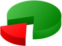
A pie chart is a circular diagram that represents numerical percentages. The circle is divided into slices, with the size of each slice proportional to the category it represents. It is named because it resembles a sliced pie and can be “served” in many different ways.

An example pie chart below shows Australia’s two-party preferred vote before the last election, with Labor on 55% and the the Coalition on 45%. The two near semi-circles show the relatively tight race—this is a useful example of a pie chart.

What’s wrong with pie charts?

Once we have more than two categories, pie charts can easily misrepresent percentages and become hard to read.

The three charts below are a good example—it is very hard to work out which of the five areas is the largest. The pie chart’s circularity means the areas lack a common reference point.

Pie charts also do badly when there are lots of categories. For example, this chart from a study on data sources used for COVID data visualization shows hundreds of categories in one pie.

The tiny slices, lack of clear labeling and the kaleidoscope of colors make interpretation difficult for anyone.

It’s even harder for a color blind person. For example, this is a simulation of what the above chart would look like to a person with deuteranomaly or reduced sensitivity to green light. This is the most common type of color blindness, affecting roughly 4.6% of the population.

It can get even worse if we take pie charts and make them three-dimensional. This can lead to egregious misrepresentations of data.

Below, the yellow, red and green areas are all the same size (one-third), but appear to be different based on the angle and which slice is placed at the bottom of the pie.

So why are pie charts everywhere?

Despite the well known problems with pie charts, they are everywhere. They are in journal articles, Ph.D. theses, political polling, books, newspapers and government reports. They’ve even been used by the Australian Bureau of Statistics.

While statisticians have criticized them for decades, it’s hard to argue with this logic: “If pie charts are so bad, why are there so many of them?”

Possibly they are popular because they are popular, which is a circular argument that suits a pie chart.

What’s a good alternative to pie charts?

There’s a simple fix that can effectively summarize big data in a small space and still allow creative color schemes.

It’s the humble bar chart. Remember the brain-aching pie chart example above with the five categories? Here’s the same example using bars—we can now instantly see which category is the largest.

Linear bars are easier on the eye than the non-linear segments of a pie chart. But beware the temptation to make a humble bar chart look more interesting by adding a 3D effect. As you already saw, 3D charts distort perception and make it harder to find a reference point.

Below is a standard bar chart and a 3D alternative of the number of voters in the 1992 US presidential election split by family income (from under US$15K to over $75k). Using the 3D version, can you tell the number of voters for each candidate in the highest income category? Not easily.

Is it ever okay to use a pie chart?

We’ve shown some of the worst examples of pie charts to make a point. Pie charts can be okay when there are just a few categories and the percentages are dissimilar, for example with one large and one small category.

Overall, it is best to use pie charts sparingly, especially when there is a more “digestible” alternative—the bar chart.

Whenever we see pie charts, we think one of two things: their creators don’t know what they’re doing, or they know what they are doing and are deliberately trying to mislead.

A graphical summary aims to easily and quickly communicate the data. If you feel the need to spruce it up, you’re likely reducing understanding without meaning to do so.

For more such insights, log into our website https://international-maths-challenge.com

Credit of the article given to Adrian Barnett and Victor Oguoma, The Conversation



Technique could efficiently solve partial differential equations for numerous applications

In fields such as physics and engineering, partial differential equations (PDEs) are used to model complex physical processes to generate insight into how some of the most complicated physical and natural systems in the world function.

To solve these difficult equations, researchers use high-fidelity numerical solvers, which can be very time consuming and computationally expensive to run. The current simplified alternative, data-driven surrogate models, compute the goal property of a solution to PDEs rather than the whole solution. Those are trained on a set of data that has been generated by the high-fidelity solver, to predict the output of the PDEs for new inputs. This is data-intensive and expensive because complex physical systems require a large number of simulations to generate enough data.

In a new paper, “Physics-enhanced deep surrogates for partial differential equations,” published in December in Nature Machine Intelligence, a new method is proposed for developing data-driven surrogate models for complex physical systems in such fields as mechanics, optics, thermal transport, fluid dynamics, physical chemistry, and climate models.

The paper was authored by MIT’s professor of applied mathematics Steven G. Johnson along with Payel Das and Youssef Mroueh of the MIT-IBM Watson AI Lab and IBM Research; Chris Rackauckas of Julia Lab; and Raphaël Pestourie, a former MIT postdoc who is now at Georgia Tech. The authors call their method “physics-enhanced deep surrogate” (PEDS), which combines a low-fidelity, explainable physics simulator with a neural network generator. The neural network generator is trained end-to-end to match the output of the high-fidelity numerical solver.

“My aspiration is to replace the inefficient process of trial and error with systematic, computer-aided simulation and optimization,” says Pestourie. “Recent breakthroughs in AI like the large language model of ChatGPT rely on hundreds of billions of parameters and require vast amounts of resources to train and evaluate. In contrast, PEDS is affordable to all because it is incredibly efficient in computing resources and has a very low barrier in terms of infrastructure needed to use it.”

In the article, they show that PEDS surrogates can be up to three times more accurate than an ensemble of feedforward neural networks with limited data (approximately 1,000 training points), and reduce the training data needed by at least a factor of 100 to achieve a target error of 5%. Developed using the MIT-designed Julia programming language, this scientific machine-learning method is thus efficient in both computing and data.

The authors also report that PEDS provides a general, data-driven strategy to bridge the gap between a vast array of simplified physical models with corresponding brute-force numerical solvers modeling complex systems. This technique offers accuracy, speed, data efficiency, and physical insights into the process.

Says Pestourie, “Since the 2000s, as computing capabilities improved, the trend of scientific models has been to increase the number of parameters to fit the data better, sometimes at the cost of a lower predictive accuracy. PEDS does the opposite by choosing its parameters smartly. It leverages the technology of automatic differentiation to train a neural network that makes a model with few parameters accurate.”

“The main challenge that prevents surrogate models from being used more widely in engineering is the curse of dimensionality—the fact that the needed data to train a model increases exponentially with the number of model variables,” says Pestourie. “PEDS reduces this curse by incorporating information from the data and from the field knowledge in the form of a low-fidelity model solver.”

The researchers say that PEDS has the potential to revive a whole body of the pre-2000 literature dedicated to minimal models—intuitive models that PEDS could make more accurate while also being predictive for surrogate model applications.

“The application of the PEDS framework is beyond what we showed in this study,” says Das. “Complex physical systems governed by PDEs are ubiquitous, from climate modeling to seismic modeling and beyond. Our physics-inspired fast and explainable surrogate models will be of great use in those applications, and play a complementary role to other emerging techniques, like foundation models.”

For more such insights, log into our website https://international-maths-challenge.com

Credit of the article given to Sandi Miller, Massachusetts Institute of Technology


Mathematicians Discovered The Ultimate Bathroom Tile In 2023

After decades of searching, mathematicians discovered a single shape that can cover a surface without forming repeating patterns, launching a small industry of “aperiodic monotile” merchandise.

The “hat” shape can tile an infinite plane without creating repeating patterns

It is rare for a shape to make a splash, but this year one did just that with the announcement of the first ever single tile that can cover a surface without forming repeating patterns. The discovery of this “aperiodic monotile” in March has since inspired everything from jigsaw puzzles to serious research papers.

“It’s more than I can keep up with in terms of the amount and even, to some extent, the level and depth of the material, because I’m not really a practising mathematician, I’m more of a computer scientist,” says Craig Kaplan at the University of Waterloo, Canada. He is on the team that found the shape, which it called the “hat”. Mathematicians had sought such an object for decades.

After revealing the tile in March, the team unveiled a second shape in May, the “spectre”, which improved on the hat by not requiring its mirror image to tile fully, making it more useful for real surfaces.

The hat has since appeared on T-shirts, badges, bags and as cutters that allow you to make your own ceramic versions.

It has also sparked more than a dozen papers in fields from engineering to chemistry. Researchers have investigated how the structure maps into six-dimensional spaces and the likely physical properties of a material with hat-shaped crystals. Others have found that structures built with repeating hat shapes could be more resistant to fracturing than a honeycomb pattern, which is renowned for its strength.

Kaplan says a scientific instrument company has also expressed an interest in using a mesh with hat-shaped gaps to collect atmospheric samples on Mars, as it believes that the pattern may be less susceptible to problems than squares.

“It’s a bit bittersweet,” says Kaplan. “We’ve set these ideas free into the world and they’ve taken off, which is wonderful, but leaves me a little bit melancholy because it’s not mine any more.”

However, the team has no desire to commercialise the hat, he says. “The four of us agreed early on that we’d much rather let this be free and see what wonderful things people do with it, rather than trying to protect it in any way. Patents are something that, as mathematicians, we find distasteful.”

For more such insights, log into www.international-maths-challenge.com.

*Credit for article given to Matthew Sparkes*


The Mathematically Perfect Table Size For Solving Any Jigsaw Puzzle

When choosing the perfectly sized table to do your jigsaw puzzle on, work out the area of the completed puzzle and multiply it by 1.73.

People may require a larger table if they like to lay all the pieces out at the start, rather than keeping them in the box or in piles

How large does your table need to be when doing a jigsaw puzzle? The answer is the area of the puzzle when assembled multiplied by 1.73. This creates just enough space for all the pieces to be laid flat without any overlap.

“My husband and I were doing a jigsaw puzzle one day and I just wondered if you could estimate the area that the pieces take up before you put the puzzle together,” says Madeleine Bonsma-Fisher at the University of Toronto in Canada.

To uncover this, Bonsma-Fisher and her husband Kent Bonsma-Fisher, at the National Research Council Canada, turned to mathematics.

Puzzle pieces take on a range of “funky shapes” that are often a bit rectangular or square, says Madeleine Bonsma-Fisher. To get around the variation in shapes, the pair worked on the basis that all the pieces took up the surface area of a square. They then imagined each square sitting inside a circle that touches its corners.

By considering the area around each puzzle piece as a circle, a shape that can be packed in multiple ways, they found that a hexagonal lattice, similar to honeycomb, would mean the pieces could interlock with no overlap. Within each hexagon is one full circle and parts of six circles.

They then found that the area taken up by the unassembled puzzle pieces arranged in the hexagonal pattern would always be the total area of the completed puzzle – calculated by multiplying its length by its width – multiplied by the root of 3, or 1.73.

This also applies to jigsaw puzzle pieces with rectangular shapes, seeing as these would similarly fit within a circle.

While doing a puzzle, some people keep pieces that haven’t yet been used in the box, while others arrange them in piles or lay them on a surface, the latter being Madeleine Bonsma-Fisher’s preferred method. “If you really want to lay all your pieces out flat and be comfortable, your table should be a little over twice as big as your sample puzzle,” she says.

For more such insights, log into www.international-maths-challenge.com.

*Credit for article given to Chen Ly*


How counting by 10 helps children learn about the meaning of numbers

When children start school, they learn how to recite their numbers (“one, two, three…”) and how to write them (1, 2, 3…). Learning about what those numbers mean is even more challenging, and this becomes trickier yet when numbers have more than one digit — such as 42 and 608.

It turns out that the meaning of such “multidigit” numbers cannot be gleaned from simply looking at them or by performing calculations with them. Our number system has many hidden meanings that are not transparent, making it difficult for children to comprehend it.

In collaboration with elementary teachers, the Mathematics Teaching and Learning Lab at Concordia University explores tools that can support young children’s understanding of multidigit numbers.

We investigate the impact of using concrete objects (like bundling straws into groups of 10). We also investigate the use of visual tools, such as number lines and charts, or words to represent numbers (the word for 40 is “forty”) and written notation (for example, 42).

Our recent research examined whether the “hundreds chart” — 10 by 10 grids containing numbers from one to 100, with each row in the chart containing numbers in groups of 10 — could be useful for teaching children about counting by 10, something foundational for understanding how numbers work.

When children start learning about numbers, they do not naturally see tens and ones in a number like 42. (Shutterstock)

What’s in a number?

Most adults know that the placement of the “4” and “2” in 42 means four tens and two ones, respectively.

But when young children start learning about numbers, they do not naturally see 10s and ones in a number like 42. They think the number represents 42 things counted from one to 42 without distinguishing between the meaning of the digits “4” and “2.” Over time, through counting and other activities, children see the four as a collection of 40 ones.

This realization is not sufficient, however, for learning more advanced topics in math.

An important next step is to see that 42 is made up of four distinct groups of 10 and two ones, and that the four 10s can be counted as if they were ones (for example, 42 is one, two, three, four 10s and one, two, “ones”).

Ultimately, one of the most challenging aspects of understanding numbers is that groups of ten and ones are different kinds of units.

Numbers can be arranged in different ways

The numbers in hundreds charts can be arranged in different ways. A top-down hundreds chart has the digit “1” in the top-left corner and 100 in the bottom-right corner.

A top-down hundreds chart. (Vera Wagner), Author provided (no reuse)

The numbers increase by 10 moving downward one row at a time, like going from 24 to 34 using one hop down, for instance. A second type of chart is the “bottom-up” chart, which has the numbers increasing in the opposite direction.

A bottom-up hundreds chart. (Vera Wagner), Author provided (no reuse)

Counting by 10s

Children can move from one number to another in the chart to solve problems. Considering 24 + 20, for example, children could start on 24 and move 20 spaces to land on 44.

Another way would be to move up (or down, depending on the chart) two rows (for example, counting “one,” “two”) until they land on 44. This second method shows a developing understanding of multidigit numbers being composed of distinct groups of 10, which is critical for an advanced knowledge of the number system.

For her master’s research at Concordia University, Vera Wagner, one of the authors of this story, thought children might find it more intuitive to solve problems with the bottom-up chart, where the numbers get larger with upward movement.

After all, plants grow taller and liquid rises in a glass as it is filled. Because of such familiar experiences, she thought children would move by tens more frequently in the bottom-up chart than in the top-down chart.


Study with kindergarteners, Grade 1 students

To examine this hypothesis, we worked with 47 kindergarten and first grade students in Canada and the United States. All the children but one spoke English at home. In addition to English, 14 also spoke French, four spoke Spanish, one spoke Russian, one spoke Arabic, one spoke Mandarin and one communicated to some extent in ASL at home.

We assigned all child participants in the study an online version of either a top-down or bottom-up hundreds chart, programmed by research assistant André Loiselle, to solve arithmetic word problems.

What we found surprised us: children counted by tens more often with the top-down chart than the bottom-up one. This was the exact opposite of what we thought they might do!

This finding suggests that the top-down chart fosters children’s counting by tens as if they were ones (that is, up or down one row at a time), an important step in their mathematical development. Children using the bottom-up chart were more likely to confuse the digits and move in the wrong direction.

Tools can impact learning

Tools used in the math classroom can impact children’s learning. (Shutterstock)

Our research suggests that the types of tools used in the math classroom can impact children’s learning in different ways.

One advantage of the top-down chart could be the corresponding

Our research suggests that the types of tools used in the math classroom can impact children’s learning in different ways.

One advantage of the top-down chart could be the corresponding left-to-right and downward movement that matches the direction in which children learn to read in English and French, the official languages of instruction in the schools in our study. Children who learn to read in a different direction (for example, from right to left, as in Arabic) may interact with some math tools differently from children whose first language is English or French.

The role of cultural experiences in math learning opens up questions about the design of teaching tools for the classroom, and the relevance of culturally responsive mathematics teaching. Future research could seek to directly examine the relation between reading direction and the use of the hundreds chart.

For more such insights, log into our website https://international-maths-challenge.com

Credit of the article given to The Conversation


Mathematicians Found a Guaranteed Way to Win The Lottery

A pair of mathematicians studied the UK National Lottery and figured out a combination of 27 tickets that guarantees you will always win, but they tell New Scientist they don’t bother to play.

David Cushing and David Stewart calculate a winning solution

Earlier this year, two mathematicians revealed that it is possible to guarantee a win on the UK national lottery by buying just 27 tickets, despite there being 45,057,474 possible draw combinations. The pair were shocked to see their findings make headlines around the world and inspire numerous people to play these 27 tickets – with mixed results – and say they don’t bother to play themselves.

David Cushing and David Stewart at the University of Manchester, UK, used a mathematical field called finite geometry to prove that particular sets of 27 tickets would guarantee a win.

They placed each of the lottery numbers from 1 to 59 in pairs or triplets on a point within one of five geometrical shapes, then used these to generate lottery tickets based on the lines within the shapes. The five shapes offer 27 such lines, meaning that 27 tickets will cover every possible winning combination of two numbers, the minimum needed to win a prize. Each ticket costs £2.

It was an elegant and intuitive solution to a tricky problem, but also an irresistible headline that attracted newspapers, radio stations and television channels from around the world. And it also led many people to chance their luck – despite the researchers always pointing out that it was, statistically speaking, a very good way to lose money, as the winnings were in no way guaranteed to even cover the cost of the tickets.

Cushing says he has received numerous emails since the paper was released from people who cheerily announce that they have won tiny amounts, like two free lucky dips – essentially another free go on the lottery. “They were very happy to tell me how much they’d lost basically,” he says.

The pair did calculate that their method would have won them £1810 if they had played on one night during the writing of their research paper – 21 June. Both Cushing and Stewart had decided not to play the numbers themselves that night, but they have since found that a member of their research group “went rogue” and bought the right tickets – putting himself £1756 in profit.

“He said what convinced him to definitely put them on was that it was summer solstice. He said he had this feeling,” says Cushing, shaking his head as he speaks. “He’s a professional statistician. He is incredibly lucky with it; he claims he once found a lottery ticket in the street and it won £10.”

Cushing and Stewart say that while their winning colleague – who would prefer to remain nameless – has not even bought them lunch as a thank you for their efforts, he has continued to play the 27 lottery tickets. However, he now randomly permutes the tickets to alternative 27-ticket, guaranteed-win sets in case others have also been inspired by the set that was made public. Avoiding that set could avert a situation where a future jackpot win would be shared with dozens or even hundreds of mathematically-inclined players.

Stewart says there is no way to know how many people are doing the same because Camelot, which runs the lottery, doesn’t release that information. “If the jackpot comes up and it happens to match exactly one of the [set of] tickets and it gets split a thousand ways, that will be some indication,” he says.

Nonetheless, Cushing says that he no longer has any interest in playing the 27 tickets. “I came to the conclusion that whenever we were involved, they didn’t make any money, and then they made money when we decided not to put them on. That’s not very mathematical, but it seemed to be what was happening,” he says.

And Stewart is keen to stress that mathematics, no matter how neat a proof, can never make the UK lottery a wise investment. “If every single man, woman and child in the UK bought a separate ticket, we’d only have a quarter chance of someone winning the jackpot,” he says.

For more such insights, log into www.international-maths-challenge.com.

*Credit for article given to Matthew Sparkes*


Decades-Old Mathematical Mystery About The Game Of Life Finally Solved

A mathematical game governed by simple rules throws up patterns of seemingly infinite complexity – and now a question that has puzzled hobbyists for decades has a solution.

A pattern in the Game of Life that repeats after every 19 steps

A long-standing mystery about repeating patterns in a two-dimensional mathematical game has been solved after more than 50 years with the discovery of two final pieces in the puzzle.

The result is believed to have no practical application whatsoever, but will satisfy the curiosity of the coterie of hobbyists obsessed with the Game of Life.

Invented by mathematician John Conway in 1970, the Game of Life is a cellular automaton – a simplistic world simulation that consists of a grid of “live” cells and “dead” cells. Players create a starting pattern as an input and the pattern is updated generation after generation according to simple rules.

A live cell with fewer than two neighbouring live cells is dead in the next generation; a live cell with two or three neighbouring live cells remains live; and a live cell with more than three neighbouring live cells dies. A dead cell with exactly three neighbouring live cells becomes live in the next generation. Otherwise, it remains dead.

These rules create evolving patterns of seemingly infinite complexity that throw up three types of shape: static objects that don’t change; “oscillators”, which form a repeating but stationary pattern; and “spaceships”, which repeat but also move across the grid.

One of the enduring problems in Game of Life research is whether there are oscillators with every “period”: ones that repeat every two steps, every three steps and so on, to infinity. There was a strong clue that this would be true when mathematician David Buckingham designed a technique that could create oscillators with any period above 57, but there were still missing oscillators for some smaller numbers.

Now, a team of hobbyists has filled those last remaining gaps by publishing a paper that describes oscillators with periods of 19 and 41 – the final missing shapes.

One member of the team, Mitchell Riley at New York University Abu Dhabi, works on the problem as a hobby alongside his research in a quantum computing group. He says there are lots of methods to generate new oscillators, but no way has been found to create them with specific periods, meaning that research in this area is a game of chance. “It’s just like playing darts – we’ve just never hit 19, and we’ve never hit 41,” he says.

Riley had been scouring lists of known shapes that consist of two parts, a hassler and a catalyst. Game of Life enthusiasts coined these terms for static shapes – catalysts – that contain a changing shape inside – a hassler. The interior reacts to the exterior, but leaves it unchanged, and together they form an oscillator of a certain period. Riley’s contribution was writing a computer program to discover potentially useful catalysts.

“The stars have to align,” he says. “You need the reaction in the middle to not destroy the thing on the outside, and the reaction in the middle, just by chance, to return to its original state in one of these new periods.”

Riley says that there are no applications known for this research and that he was drawn to the problem by “pure curiosity”.

Susan Stepney at the University of York, UK, says the work demonstrates some “extremely clever and creative techniques”, but it certainly isn’t the final conclusion of research on Conway’s creation.

“I don’t think work on Game of Life will ever be complete,” says Stepney. “The system is computationally universal, so there is always more behaviour to find, and it is seemingly so simple to describe, but so complex in its behaviour, that it remains fascinating to many.”

For more such insights, log into www.international-maths-challenge.com.

*Credit for article given to Matthew Sparkes*


Time to abandon null hypothesis significance testing? Moving beyond the default approach

Researchers from Northwestern University, University of Pennsylvania, and University of Colorado published a new Journal of Marketing study that proposes abandoning null hypothesis significance testing (NHST) as the default approach to statistical analysis and reporting.

The study is titled “‘Statistical Significance’ and Statistical Reporting: Moving Beyond Binary” and is authored by Blakeley B. McShane, Eric T. Bradlow, John G. Lynch, Jr., and Robert J. Meyer.

Null hypothesis significance testing (NHST) is the default approach to statistical analysis and reporting in marketing and, more broadly, in the biomedical and social sciences. As practiced, NHST involves

  1. assuming that the intervention under investigation has no effect along with other assumptions,
  2. computing a statistical measure known as a P-value based on these assumptions, and
  3. comparing the computed P-value to the arbitrary threshold value of 0.05.

If the P-value is less than 0.05, the effect is declared “statistically significant,” the assumption of no effect is rejected, and it is concluded that the intervention has an effect in the real world. If the P-value is above 0.05, the effect is declared “statistically nonsignificant,” the assumption of no effect is not rejected, and it is concluded that the intervention has no effect in the real world.

Criticisms of NHST

Despite its default role, NHST has long been criticized by both statisticians and applied researchers, including those within marketing. The most prominent criticisms relate to the dichotomization of results into “statistically significant” and “statistically nonsignificant.”

For example, authors, editors, and reviewers use “statistical (non)significance” as a filter to select which results to publish. Meyer says that “this creates a distorted literature because the effects of published interventions are biased upward in magnitude. It also encourages harmful research practices that yield results that attain so-called statistical significance.”

Lynch adds that “NHST has no basis because no intervention has precisely zero effect in the real world and small P-values and ‘statistical significance’ are guaranteed with sufficient sample sizes. Put differently, there is no need to reject a hypothesis of zero effect when it is already known to be false.”

Perhaps the most widespread abuse of statistics is to ascertain where some statistical measure such as a P-value stands relative to 0.05 and take it as a basis to declare “statistical (non)significance” and to make general and certain conclusions from a single study.

“Single studies are never definitive and thus can never demonstrate an effect or no effect. The aim of studies should be to report results in an unfiltered manner so that they can later be used to make more general conclusions based on cumulative evidence from multiple studies. NHST leads researchers to wrongly make general and certain conclusions and to wrongly filter results,” says Bradlow.

P-values naturally vary a great deal from study to study,” explains McShane. As an example, a “statistically significant” original study with an observed P-value of p = 0.005 (far below the 0.05 threshold) and a “statistically nonsignificant” replication study with an observed P-value of p = 0.194 (far above the 0.05 threshold) are highly compatible with one another in the sense that the observed P-value, assuming no difference between them, is p= 0.289.

He adds that “however when viewed through the lens of ‘statistical (non)significance,’ these two studies appear categorically different and are thus in contradiction because they are categorized differently.”

Recommended changes to statistical analysis

The authors propose a major transition in statistical analysis and reporting. Specifically, they propose abandoning NHST—and the P-value thresholds intrinsic to it—as the default approach to statistical analysis and reporting. Their recommendations are as follows:

  • “Statistical (non)significance” should never be used as a basis to make general and certain conclusions.
  • “Statistical (non)significance” should also never be used as a filter to select which results to publish.
  • Instead, all studies should be published in some form or another.
  • Reporting should focus on quantifying study results via point and interval estimates. All of the values inside conventional interval estimates are at least reasonably compatible with the data given all of the assumptions used to compute them; therefore, it makes no sense to single out a specific value, such as the null value.
  • General conclusions should be made based on the cumulative evidence from multiple studies.
  • Studies need to treat P-values continuously and as just one factor among many—including prior evidence, the plausibility of mechanism, study design, data quality, and others that vary by research domain—that require joint consideration and holistic integration.
  • Researchers must also respect the fact that such conclusions are necessarily tentative and subject to revision as new studies are conducted.

Decisions are seldom necessary in scientific reporting and are best left to end-users such as managers and clinicians when necessary.

In such cases, they should be made using a decision analysis that integrates the costs, benefits, and probabilities of all possible consequences via a loss function (which typically varies dramatically across stakeholders)—not via arbitrary thresholds applied to statistical summaries such as P-values (“statistical (non)significance”) which, outside of certain specialized applications such as industrial quality control, are insufficient for this purpose.

For more such insights, log into our website https://international-maths-challenge.com

Credit of the article given to American Marketing Association


Tiny Balls Fit Best Inside A Sausage, Physicists Confirm

Mathematicians have long been fascinated by the most efficient way of packing spheres in a space, and now physicists have confirmed that the best place to put them is into a sausage shape, at least for small numbers of balls.

Simulations show microscopic plastic balls within a cell membrane

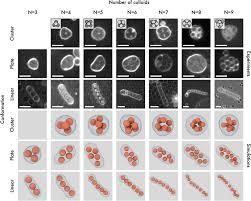
What is the most space-efficient way to pack tennis balls or oranges? Mathematicians have studied this “sphere-packing” problem for centuries, but surprisingly little attention has been paid to replicating the results in the real world. Now, physical experiments involving microscopic plastic balls have confirmed what mathematicians had long suspected – with a small number of balls, it is best to stick them in a sausage.

Kepler was the first person to tackle sphere packing, suggesting in 1611 that a pyramid would be the best way to pack cannonballs for long voyages, but this answer was only fully proven by mathematicians in 2014.

This proof only considers the best way of arranging an infinite number of spheres, however. For finite sphere packings, simply placing the balls in a line, or sausage, is more efficient until there are around 56 spheres. At this point, the balls experience what mathematicians call the “sausage catastrophe” and something closer to pyramid packing becomes more efficient.

But what about back in the real world? Sphere-packing theories assume that the balls are perfectly hard and don’t attract or repel each other, but this is rarely true in real life – think of the squish of a tennis ball or an orange.

One exception is microscopic polystyrene balls, which are very hard and basically inert. Hanumantha Rao Vutukuri at the University of Twente in the Netherlands and his team, who were unaware of mathematical sphere-packing theories, were experimenting with inserting these balls into empty cell membranes and were surprised to find them forming sausages.

“One of my students observed a linear packing, but it was quite puzzling,” says Vutukuri. “We thought that there was some fluke, so he repeated it a couple of times and every time he observed similar results,” says Vutukuri. “I was wondering, ‘why is this happening?’ It’s a bit counterintuitive.”

After reading up on sphere packing, Vutukuri and his team decided to investigate and carried out simulations for different numbers of polystyrene balls in a bag. They then compared their predictions with experiments using up to nine real polystyrene balls that had been squeezed into cell membranes immersed in a liquid solution. They could then shrink-wrap the balls by changing the concentration of the solution, causing the membranes to tighten, and see what formation the balls settled in using a microscope.

“For up to nine spheres, we showed, both experimentally and in simulations, that the sausage is the best packed,” says team member Marjolein Dijkstra at Utrecht University, the Netherlands. With more than nine balls, the membrane became deformed by the pressure of the balls. The team ran simulations for up to 150 balls and reproduced the sausage catastrophe, where it suddenly becomes more efficient to pack things in polyhedrons, with between 56  and 70 balls.

The sausage formation for a small number of balls is unintuitive, says Erich Müller at Imperial College London, but makes sense because of the large surface area of the membrane with respect to the balls at low numbers. “When dimensions become really, really small, then the wall effects become very important,” he says.

The findings could have applications in drug delivery, such as how to most efficiently fit hard antibiotic molecules, like gold, inside cell-like membranes, but the work doesn’t obviously translate at this point, says Müller.


For more such insights, log into www.international-maths-challenge.com.

*Credit for article given to Alex Wilkins*


The first validation of the Lillo Mike Farmer Model on a large financial market dataset

Economics and physics are distinct fields of study, yet some researchers have been bridging the two together to tackle complex economics problems in innovative ways. This resulted in the establishment of an interdisciplinary research field, known as econophysics, which specializes in solving problems rooted in economics using physics theories and experimental methods.

Researchers at Kyoto University carried out an econophysics study aimed at studying financial market behaviour using a statistical physics framework, known as the Lillo, Mike, and Farmer (LMF) model. Their paper, published in Physical Review Letters, outlines the first quantitative validation of a key prediction of this physics model, which the team used to analyse microscopic data containing fluctuations in the Tokyo Stock Exchange market spanning over a period of nine years.

“If you observe the high-frequency financial data, you can find a slight predictability of the order signs regarding buy or sell market orders at a glance,” Kiyoshi Kanazawa, one of the researchers who carried out the study, told Phys.org.

“Lillo, Mike, and Farmer hypothetically modeled this appealing character in 2005, but the empirical validation of their model was absent due to a lack of large, microscopic datasets. We decided to solve this long-standing problem in econophysics by analysing large, microscopic data.”

The LMF model is a simple statistical physics model that describes so-called order-splitting behaviour. A key prediction of this model is that the order of signs representing buy or sell orders in the stock market is associated with the microscopic distribution of metaorders.

This hypothesis has been largely debated within the field of econophysics. So far, validating it was unfeasible, as it required large microscopic datasets representing financial market behaviour over the course of several years and with high resolution.

“The first key aspect of our study is that we used a large, microscopic dataset of the Tokyo Stock Exchange,” Kanazawa said. “Without such a unique dataset, it is challenging to validate the LMF model’s hypothesis. The second key point for us was to remove the statistical bias due to the long-memory character of the market-order flow. While statistical estimation is challenging regarding long-memory processes, we did our best to remove such biases using computational statistical methods.”

Kanazawa and his colleagues were the first to perform a quantitative test of the LMF model on a large microscopic financial market dataset. Notably, the results of their analyses were aligned with this model’s predictions, thus highlighting its promise for tackling economic problems and studying the financial market’s microstructure.

“Our work shows that the long memory in the market-order flows has microscopic information about the latent market demand, which might be used for designing new metrics for liquidity measurements,” Kanazawa said.

“We showed that the quantitative power of statistical physics in clarifying financial market behaviour with large, microscopic datasets. By analysing this microscopic dataset further, we would now like to establish a unifying theory of financial market microstructure parallel to the statistical physics programs from microscopic dynamics.”

For more such insights, log into our website https://international-maths-challenge.com

Credit of the article given to Ingrid Fadelli , Phys.org