Mathematicians Invent New Way to Slice Pizza into Exotic Shapes

Here’s one thing to impress your friends with the next time you order a takeaway: new and exotic ways to slice a pizza.

Most of us divide a pizza using straight cuts that all meet in the middle. But what if the centre of the pizza has a topping that some people would rather avoid, while others desperately want crust for dipping?

Mathematicians had previously come up with a recipe for slicing – formally known as a monohedral disc tiling – that gives you 12 identically shaped pieces, six of which form a star extending out from the centre, while the other six divide up the crusty remainder. You start by cutting curved three-sided slices across the pizza, then dividing these slices in two to get the inside and outside groups, as shown below.

Now Joel Haddley and Stephen Worsley of the University of Liverpool, UK, have generalised the technique to create even more ways to slice. The pair have proved you can create similar tilings from curved pieces with any odd number of sides – known as 5-gons, 7-gons and so on (shaded below) – then dividing them in two as before. “Mathematically there is no limit whatsoever,” says Haddley, though you might find it impractical to carry out the scheme beyond 9-gon pieces.

Haddley and Worsley went one further by cutting wedges in the corners of their shapes, creating bizarre, spikey pieces that still form a circle (the image below shows this happening with 5-gons). “It’s really surprising,” says Haddley.


As with many mathematical results, its usefulness isn’t immediately obvious. The same is true of another pizza theorem, which looks at what happens when a pizza is haphazardly cut off-centre.

“I’ve no idea whether there are any applications at all to our work outside of pizza-cutting,” says Haddley, who has actually tried slicing a pizza in this way for real (see below). But the results are “interesting mathematically, and you can produce some nice pictures”.

For more such insights, log into www.international-maths-challenge.com.

*Credit for article given to Jacob Aron*


Make mine a double: Moore’s Law and the future of mathematics

What do iPhones, Twitter, Netflix, cleaner cities, safer cars, state-of-the-art environmental management and modern medical diagnostics have in common? They are all made possible by Moore’s Law.

Moore’s Law stems from a seminal 1965 article by Intel founder Gordon Moore. He wrote:

“The complexity for minimum component costs has increased at a rate of roughly a factor of two per year … Certainly over the short term this rate can be expected to continue, if not to increase. Over the longer term, the rate of increase is a bit more uncertain, although there is no reason to believe it will not remain nearly constant for at least ten years. That means, by 1975, the number of components per integrated circuit for minimum cost will be 65,000.”

Moore noted that in 1965 engineering advances were enabling a doubling in semiconductor density every 12 months, but this rate was later modified to roughly 18 months. Informally, we may think of this as doubling computer performance.

In any event, Moore’s Law has now continued unabated for 45 years, defying several confident predictions it would soon come to a halt, and represents a sustained exponential rate of progress that is without peer in the history of human technology. Here is a graph of Moore’s Law, shown with the transistor count of various computer processors:

Where we’re at with Moore’s Law

At the present time, researchers are struggling to keep Moore’s Law on track. Processor clock rates have stalled, as chip designers have struggled to control energy costs and heat dissipation, but the industry’s response has been straightforward — simply increase the number of processor “cores” on a single chip, together with associated cache memory, so that aggregate performance continues to track or exceed Moore’s Law projections.

The capacity of leading-edge DRAM main memory chips continues to advance apace with Moore’s Law. The current state of the art in computer memory devices is a 3D design, which will be jointly produced by IBM and Micron Technology, according to a December 2011 announcement by IBM representatives.

As things stand, the best bet for the future of Moore’s Law are nanotubes — submicroscopic tubes of carbon atoms that have remarkable properties.

According to a recent New York Times article, Stanford researchers have created prototype electronic devices by first growing billions of carbon nanotubes on a quartz surface, then coating them with an extremely fine layer of gold atoms. They then used a piece of tape (literally!) to pick the gold atoms up and transfer them to a silicon wafer. The researchers believe that commercial devices could be made with these components as early as 2017.

Moore’s Law in science and maths

So what does this mean for researchers in science and mathematics?

Plenty, as it turns out. A scientific laboratory typically uses hundreds of high-precision devices that rely crucially on electronic designs, and with each step of Moore’s Law, these devices become ever cheaper and more powerful. One prominent case is DNA sequencers. When scientists first completed sequencing a human genome in 2001, at a cost of several hundred million US dollars, observers were jubilant at the advances in equipment that had made this possible.

Now, only ten years later, researchers expect to reduce this cost to only US$1,000 within two years and genome sequencing may well become a standard part of medical practice. This astounding improvement is even faster than Moore’s Law!

Applied mathematicians have benefited from Moore’s Law in the form of scientific supercomputers, which typically employ hundreds of thousands of state-of-the-art components. These systems are used for tasks such as climate modelling, product design and biological structure calculations.

Today, the world’s most powerful system is a Japanese supercomputer that recently ran the industry-standard Linpack benchmark test at more than ten “petaflops,” or, in other words, 10 quadrillion floating-point operations per second.

Below is a graph of the Linpack performance of the world’s leading-edge systems over the time period 1993-2011, courtesy of the website Top 500. Note that over this 18-year period, the performance of the world’s number one system has advanced more than five orders of magnitude. The current number one system is more powerful than the sum of the world’s top 500 supercomputers just four years ago.

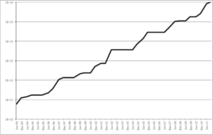
Linpack performance over time.

Pure mathematicians have been a relative latecomer to the world of high-performance computing. The present authors well remember the era, just a decade or two ago, when the prevailing opinion in the community was that “real mathematicians don’t compute.”

But thanks to a new generation of mathematical software tools, not to mention the ingenuity of thousands of young, computer-savvy mathematicians worldwide, remarkable progress has been achieved in this arena as well (see our 2011 AMS Notices article on exploratory experimentation in mathematics).

In 1963 Daniel Shanks, who had calculated pi to 100,000 digits, declared that computing one billion digits would be “forever impossible.” Yet this level was reached in 1989. In 1989, famous British physicist Roger Penrose, in the first edition of his best-selling book The Emperor’s New Mind, declared that humankind would likely never know whether a string of ten consecutive sevens occurs in the decimal expansion of pi. Yet this was found just eight years later, in 1997.

Computers are certainly being used for more than just computing and analysing digits of pi. In 2003, the American mathematician Thomas Hales completed a computer-based proof of Kepler’s conjecture, namely the long-hypothesised fact that the simple way the grocer stacks oranges is in fact the optimal packing for equal-diameter spheres. Many other examples could be cited.

Future prospects

So what does the future hold? Assuming that Moore’s Law continues unabated at approximately the same rate as the present, and that obstacles in areas such as power management and system software can be overcome, we will see, by the year 2021, large-scale supercomputers that are 1,000 times more powerful and capacious than today’s state-of-the-art systems — “exaflops” computers (see NAS Report). Applied mathematicians eagerly await these systems for calculations, such as advanced climate models, that cannot be done on today’s systems.

Pure mathematicians will use these systems as well to intuit patterns, compute integrals, search the space of mathematical identities, and solve intricate symbolic equations. If, as one of us discussed in a recent Conversation article, such facilities can be combined with machine intelligence, such as a variation of the hardware and software that enabled an IBM system to defeat the top human contestants in the North American TV game show Jeopardy! we may see a qualitative advance in mathematical discovery and even theory formation.

It is not a big leap to imagine that within the next ten years tailored and massively more powerful versions of Siri (Apple’s new iPhone assistant) will be an integral part of mathematics, not to mention medicine, law and just about every other part of human life.

Some observers, such as those in the Singularity movement, are even more expansive, predicting a time just a few decades hence when technology will advance so fast that at the present time we cannot possibly conceive or predict the outcome.

Your present authors do not subscribe to such optimistic projections, but even if more conservative predictions are realised, it is clear that the digital future looks very bright indeed. We will likely look back at the present day with the same technological disdain with which we currently view the 1960s.

For more such insights, log into our website https://international-maths-challenge.com

Credit of the article given to Jonathan Borwein (Jon), University of Newcastle and David H. Bailey, University of California, Davis


Algebraic Elements Are Like Limit Points!

When you hear the word closure, what do you think of? I think of wholeness – you know, tying loose ends, wrapping things up, filling in the missing parts. This same idea is behind the mathematician’s notion of closure, as in the phrase “taking the closure” of a set. Intuitively this just means adding in any missing pieces so that the result is complete, whole. For instance, the circle on the left is open because it’s missing its boundary. But when we take its closure and include the boundary, we say the circle is closed.

As another example, consider the set of all real numbers strictly between 0 and 1, i.e. the open interval (0,1). Notice that we can get arbitrarily close to 0, but we can’t quite reach it. In some sense, we feel that 0 might as well be included in set, right? I mean, come on, 0.0000000000000000000000000000000000000001 is basically 0, right? So by not considering 0 as an element in our set, we feel like something’s missing. The same goes for 1.

We say an element is a limit point of a given set if that element is “close” to the set,* and we say the set’s closure is the set together with its limit points. (So 0 and 1 are both limit points of (0,1) and its closure is [0,1].) It turns out the word closure is also used in algebra, specifically the algebraic closure of a field, but there it has a completely different definition which has to do with roots of polynomials, called algebraic elementsNow why would mathematicians use the same word to describe two seemingly different things? The purpose of today’s post is to make the observation that they’re not so different after all! This may be somewhat obvious, but it wasn’t until after a recent conversation with a friend that I saw the connection:


‍algebraic elements of a field

are like

limit points of a sequence!

(Note: I’m not claiming any theorems here, this is just a student’s simple observation.)


For more such insights, log into www.international-maths-challenge.com.

*Credit for article given to Tai-Danae Bradley*


Ways to Show a Group is Abelian

After some exposure to group theory, you quickly learn that when trying to prove a group GG is abelian, checking if xy=yxxy=yx for arbitrary x,yx,y in GG is not always the most efficient – or helpful! – tactic. Here is a (not comprehensive) running tab of other ways you may be able to prove your group is abelian:

Show the commutator [x,y]=xyx−1y−1[x,y]=xyx−1y−1of two arbitary elements x,y∈Gx,y∈G must be the identity

  • Show the group is isomorphic to a direct product of two abelian (sub)groups
  • Check if the group has order p2p2 for any prime pp OR if the order is pqpq for primes p≤qp≤q with p∤q−1p∤q−1.
  • Show the group is cyclic.
  • Show |Z(G)|=|G|.|Z(G)|=|G|.
  • Prove G/Z(G)G/Z(G) is cyclic. (e.g. does G/Z(G)G/Z(G) have prime order?)
  • Show that GG has a trivial commutator subgroup, i.e. is [G,G]={e}[G,G]={e}.

Here’s a thought map which is (probably) more fun than practical. Note, pp and qq denote primes below:

For more such insights, log into www.international-maths-challenge.com.

*Credit for article given to Tai-Danae Bradley*


A Math SaiBlog? Say What?

Yes! I’m writing about math. No! Don’t close your browser window. Hear me out first…

I know very well that math has a bad rap. It’s often taught or thought of as a dry, intimidating, unapproachable, completely boring, who-in-their-right-mind-would-want-to-think-about-this-on-purpose kind of subject. I get it. Math was the last thing on earth I thought I’d study. Seriously.

But my understanding of math has since changed. I used to think it was a mess of equations and formulas, only enjoyed by a small number of masochists. But oh how I was wrong! Mathematics is not just numbers. It is not just strange symbols. And it is certainly not something reserved only for the few elite geniuses of the world.

Mathematics is a language –

a language of ideas, concepts, and notions.

It’s true! Math is a language just like English, French, or Mandarin. And just like some ideas are best communicated in a particular language, other ideas are best communicated “in math.” This is why I’ve started a SaiBlog – as an aid in my own pursuit of becoming more proficient at thinking/speaking/reading mathematics.

One of the main challenges I face in this pursuit is the ability to strip away the intimidation factor

– the cryptic symbols, the elaborate vocabulary, the fancy formalities –

and unveil the true meaning of the text at hand. For me, this unveiling comes by reading and rereading, by working through problem after problem, and by writing. Quite often while learning new (and recalling old) mathematics, I have to stop and ask, “What is the text really saying behind all that jargon?” And if I can proceed to write down the idea in English (i.e. in lingo that’s easy on the brain) then that bit of information becomes engrained in my mind. Or at least it gets stored away in my brain somewhere. And if (or when) I forget it, I find that looking at my own handwritten notes conjures up the memory and the blood, sweat, and tears that went into learning that bit of info, and it all comes right back.

So Math3ma is my online repository as I make my way through this journey. Here’s the plan for now: some of the SaiBlog posts will be divided into two sections, in keeping with the aforementioned thought process:

And some posts will fall into “The Back Pocket” where I’ll keep little tidbits of math for a rainy day (or, perhaps, an exam). As for the actual content, I’m focusing on material found in the initial years of a graduate math program because, well, passing the qualifying exams is next on my agenda. But I think I’ll include some include undergrad material too. And as for future content, who knows? I’m excited to see what Math3ma can turn into.

Thanks for taking the time to peak into my journey as I work to see mathematics for what it really is–a very powerful, very beautiful language inherent in the world all around us!

For more such insights, log into www.international-maths-challenge.com.

*Credit for article given to Tai-Danae Bradley*


Mathematical model reveals commonality within the diversity of leaf decay

The colorful leaves piling up in your backyard this fall can be thought of as natural stores of carbon. In the springtime, leaves soak up carbon dioxide from the atmosphere, converting the gas into organic carbon compounds. Come autumn, trees shed their leaves, leaving them to decompose in the soil as they are eaten by microbes. Over time, decaying leaves release carbon back into the atmosphere as carbon dioxide.

In fact, the natural decay of organic carbon contributes more than 90 percent of the yearly carbon dioxide released into Earth’s atmosphere and oceans. Understanding the rate at which leaves decay can help scientists predict this global flux of carbon dioxide, and develop better models for climate change. But this is a thorny problem: A single leaf may undergo different rates of decay depending on a number of variables: local climate, soil, microbes and a leaf’s composition. Differentiating the decay rates among various species, let alone forests, is a monumental task.

Instead, MIT researchers have analysed data from a variety of forests and ecosystems across North America, and discovered general trends in decay rates among all leaves. The scientists devised a mathematical procedure to transform observations of decay into distributions of rates. They found that the shape of the resulting curve is independent of climate, location and leaf composition. However, the details of that shape—the range of rates that it spans, and the mean rate—vary with climatic conditions and plant composition. In general, the scientists found that plant composition determines the range of rates, and that as temperatures increase, all plant matter decays faster.

“There is a debate in the literature: If the climate warms, do all rates become faster by the same factor, or will some become much faster while some are not affected?” says Daniel Rothman, a co-founder of MIT’s Lorenz Center, and professor of geophysics in the Department of Earth, Atmospheric and Planetary Sciences. “The conclusion is that all rates scale uniformly as the temperature increases.”

Rothman and co-author David Forney, a PhD graduate in the Department of Mechanical Engineering, have published the results of their study, based largely on Forney’s PhD thesis, in the Journal of the Royal Society Interface.

Litter delivery

The team obtained data from an independent 10-year analysis of North American forests called the Long-term Intersite Decomposition Experiment Team (LIDET) study. For this study, researchers collected leaf litter—including grass, roots, leaves and needles—from 27 locations throughout North and Central America, ranging from Alaskan tundra to Panamanian rainforests.

The LIDET researchers separated and weighed each litter type, and identified litter composition and nutrient content. They then stored the samples in porous bags and buried the bags, each filled with a different litter type, in each of the 27 geographic locations; the samples were then dug up annually and reweighed. The data collected represented the mass of litter, of different composition, remaining over time in different environments.

Forney and Rothman accessed the LIDET study’s publicly available data online, and analysed each dataset: the litter originating at one location, subsequently divided and distributed at 27 different locations, and weighed over 10 years.

The team developed a mathematical model to convert each dataset’s hundreds of mass measurements into rates of decay—a “numerically delicate” task, Rothman says. They then plotted the converted data points on a graph, yielding a surprising result: The distribution of decay rates for each dataset looked roughly the same, forming a bell curve when plotted as a function of the order of magnitude of the rates—a surprisingly tidy pattern, given the complexity of parameters affecting decay rates.

“Not only are there different environments like grasslands and tundra and rainforest, there are different environments at the microscale too,” Forney says. “Each plant is made up of different tissues … and these all have different degradation pathways. So there’s heterogeneity at many different scales … and we’re trying to figure out if there’s some sort of commonality.”

Common curves

Going a step further, Forney and Rothman looked for parameters that affect leaf decay rates. While each dataset resembled a bell curve, there were slight variations among them. For example, some curves had higher peaks, while others were flatter; some curves shifted to the left of a graph, while others lay more to the right. The team looked for explanations for these slight variations and discovered the two parameters that most affected the details of a dataset’s curve: climate and leaf composition.

In general, the researchers observed, warmer climates tended to speed the decay of all plants, whereas colder climates slowed plant decay uniformly. The implication is that as temperatures increase, all plant matter, regardless of composition, will decay more quickly, with the same relative speedup in rate.

The team also found that plant matter such as needles that contain more lignin—a sturdy building block—have a smaller range or decay rates than leafier plants that contain less lignin and more nutrients that attract microbes. “This is an interesting ecological finding,” Forney says. “Lignin tends to shield organic compounds, which may otherwise degrade at a faster rate.”

Mark Harmon, principal investigator for the LIDET study and a professor of forest science at Oregon State University, says the team’s results add evidence to a long-held debate over rising temperature’s effect on organic decay: As temperatures rise, decomposition will likely speed up, releasing more carbon dioxide into the atmosphere, which in turn creates warmer temperatures, further speeding decay in a positive feedback loop.

“There is a wide range of results on temperature response,” says Harmon, who was not involved in the study. “Some have proposed that materials that are hard to decompose will respond more to temperature increases, and others have proposed the opposite. The current study indicates they may be the same,” meaning the positive feedback from rising temperatures may not be as strong as others have predicted.

Rothman adds that in the future, the team may use the model to predict the turnover times of various ecosystems — a finding that may improve climate change models, and help scientists understand the flux of carbon dioxide around the globe.

Rothman adds that in the future, the team may use the model to predict the turnover times of various ecosystems—a finding that may improve climate change models, and help scientists understand the flux of carbon dioxide around the globe.

“It’s a really messy problem,” Rothman says. “It’s as messy as the pile of leaves in your backyard. You would think that each pile of leaves is different, depending on which tree it’s from, where the pile is in your backyard and what the climate is like. What we’re showing is that there’s a mathematical sense in which all of these piles of leaves behave in the same way.”

For more such insights, log into our website https://international-maths-challenge.com

Credit of the article given to Jennifer Chu, Massachusetts Institute of Technology


‘Models of everything’ created to improve accuracy of long-term weather forecasting

People love to complain about the weather – and especially about weather forecasters. But real, accurate forecasting beyond five to seven days is immensely complicated, due to the sheer volume of atmospheric processes and factors. Fortunately for us, advances in computing are making it possible for mathematicians, atmospheric scientists and statisticians to create “models of everything,” which may lead to accurate long-range weather forecasts.

NC State mathematician John Harlim is working on one such “model of everything,” specifically for longer-range weather and climate prediction. He’s part of a five-year project led by NYU’s Andrew Majda that is creating simpler, less expensive stochastic models (a model that includes random variables) for extended range weather and climate prediction.

One major stumbling block to extending and improving weather predictions beyond seven-day forecasts is a lack of understanding of the tropical weather dynamics that drive global weather patterns. The mix of factors in these patterns is amazingly complex. According to Harlim, “The dynamics in the tropics involve hierarchies of processes on both huge scales – like, 10,000 km – and much smaller scales over many months.  Physical processes in individual clouds can affect these larger processes in the long run.

“In terms of a model, then, you would have to resolve the entire globe in one-kilometer chunks, look at every possible weather pattern that could possibly occur over every moment given all sorts of variables, and then scale it up,” Harlim adds. Since this approach is very expensive, computationally speaking, Harlim and his colleagues hope to develop simpler, cheaper models that can capture tropical dynamics and understand their interactions with extratropical weather patterns.

Says Harlim, “Understanding tropical dynamics is the Holy Grail of atmospheric modeling, and if we’re successful, you’ll be able to get accurate weather forecasting for months, not just days, in advance.”

Atmospheric scientist Sukanta Basu is part of a team working on a “model of everything” for atmospheric turbulence by studying airflow over complex terrain, including islands. The team wants to understand how atmospheric turbulence affects laser propagations, but their work could have other applications as well – such as predicting microbursts for aircraft safety or estimating evaporation rates for water management in agriculture. And just like Harlim’s, Basu’s model will have to take a huge number of factors into account.

“We’ll be looking at 10-meter terrain maps, finding out every spatial location and time and what the atmospheric field may look like,” Basu says. “The amount of computational power needed is huge – one simulation can fill up a terabyte disk – so we’re looking at petascale computing, which can do a quadrillion operations per second. We didn’t have computing on this scale ten years ago, so projects like this were impossible.”

For more such insights, log into our website https://international-maths-challenge.com

Credit of the article given to Tracey Peake, North Carolina State University


Math algorithm tracks crime, rumours, epidemics to source

A team of EPFL scientists has developed an algorithm that can identify the source of an epidemic or information circulating within a network, a method that could also be used to help with criminal investigations.

Investigators are well aware of how difficult it is to trace an unlawful act to its source. The job was arguably easier with old, Mafia-style criminal organizations, as their hierarchical structures more or less resembled predictable family trees.

In the Internet age, however, the networks used by organized criminals have changed. Innumerable nodes and connections escalate the complexity of these networks, making it ever more difficult to root out the guilty party. EPFL researcher Pedro Pinto of the Audiovisual Communications Laboratory and his colleagues have developed an algorithm that could become a valuable ally for investigators, criminal or otherwise, as long as a network is involved.

“Using our method, we can find the source of all kinds of things circulating in a network just by ‘listening’ to a limited number of members of that network,” explains Pinto. Suppose you come across a rumor about yourself that has spread on Facebook and been sent to 500 people; your friends, or even friends of your friends. How do you find the person who started the rumor? “By looking at the messages received by just 15󈞀 of your friends, and taking into account the time factor, our algorithm can trace the path of that information back and find the source,” Pinto adds. This method can also be used to identify the origin of a spam message or a computer virus using only a limited number of sensors within the network.

Out in the real world, the algorithm can be employed to find the primary source of an infectious disease, such as cholera. “We tested our method with data on an epidemic in South Africa provided by EPFL professor Andrea Rinaldo’s Ecohydrology Laboratory,” says Pinto. “By modeling water networks, river networks, and human transport networks, we were able to find the spot where the first cases of infection appeared by monitoring only a small fraction of the villages.”

The method would also be useful in responding to terrorist attacks, such as the 1995 sarin gas attack in the Tokyo subway, in which poisonous gas released in the city’s subterranean tunnels killed 13 people and injured nearly 1,000 more. “Using this algorithm, it wouldn’t be necessary to equip every station with detectors. A sample would be sufficient to rapidly identify the origin of the attack, and action could be taken before it spreads too far,” says Pinto.

Computer simulations of the telephone conversations that could have occurred during the terrorist attacks on September 11, 2001, were used to test Pinto’s system. “By reconstructing the message exchange inside the 9/11 terrorist network extracted from publicly released news, our system spit out the names of three potential suspects; one of whom was found to be the mastermind of the attacks, according to the official enquiry.”

The validity of this method thus has been proven a posteriori. But according to Pinto, it could also be used preventatively; for example, to understand an outbreak before it gets out of control. “By carefully selecting points in the network to test, we could more rapidly detect the spread of an epidemic,” he points out. It could also be a valuable tool for advertisers who use viral marketing strategies by leveraging the Internet and social networks to reach customers. For example, this algorithm would allow them to identify the specific Internet that are the most influential for their target audience and to understand how in these articles spread throughout the online community.

For more such insights, log into our website https://international-maths-challenge.com

Credit of the article given to Ecole Polytechnique Federale de Lausanne


Mathematicians use network theory to model champion Spanish soccer team’s style

Passing networks for the Netherlands and Spain drawn before the final game, using the passing data and tactical formations of the semi-finals. Image from arXiv:1206.6904v1

For years, sports fanatics have turned to statistics to help them gauge the relative strength or weaknesses of different teams, though some have been more amenable to the process than others. Baseball and football, for example, seem to have a statistic for every action that occurs on the field of play, with different players ranked and rated by their numbers. International football, aka soccer on the other hand has generally defied such attempts due to their being far fewer things to measure with the sport and the continuity of play. That may change however, as mathematicians Javier López Peña and Hugo Touchette of University College and Queen Mary University respectively, have applied network theory to the unique style of play of the European Championship 2012 victor, Spain. And as they describe in the paper they’ve uploaded to the preprint server arXiv, the graphic that results gives some clues as to why the team is considered one of the best of all time.

Anyone who has watched the Spanish team knows that their style of play is different from other teams. So much so it’s been given a name by fans: tiki-taka. It’s all about quick passes and exquisite teamwork. But trying to describe what the team does only leads to superlatives, which don’t really get to the heart of the matter. To help, Peña and Touchette turned to network theory, which makes sense, because soccer is played as a network of teammates working efficiently together.

Unfortunately, on paper, network theory tends to wind up looking like a bunch of hard to decipher equations, which wouldn’t help anyone except those that create them. To make it so that anyone could understand what their theories have turned up, the two used a simple drawing depicting players as nodes and their relationship to one another on the team, the amount of passing that is done between them, the way it is done and to whom, as lines between the nodes.

What shows up in the drawing first, is what everyone already knows, namely, that the team passes the ball among its players a lot. More than a lot actually. In one match during 2010’s World Cup between Spain and the Netherlands, the Spanish players out-passed their opponent 417 to 266. The drawing also highlights the fact that two players on the team are “well connected” i.e. easy for others to get to, versus just one for the opponent.

The graphic also shows what is known as “betweenness centrality,” which is a way of measuring the amount a network relies on a single node to operate at its optimum capacity. With soccer, it measures how much a team relies on an individual player. In this instance, the opponent appears far more vulnerable to disruption if that individual is covered adequately than happens with the Spanish team. Also implemented in the graphic is the notion of PageRank, developed by Google, which ranks the most popular pages by linkages. Applied to soccer it would mean the player who is passed the ball most often by teammates. With Spain, of course, it was central midfielder, Xavi.

In many ways the graphic confirms what most suspect, that Spain wins more because it relies more on precise teamwork rather than the special skills of one or two superstars. In other ways though, it shows that even soccer can be made to offer up statistics if someone looks hard enough.

For more such insights, log into our website https://international-maths-challenge.com

Credit of the article given to Bob Yirka , Phys.org


Maths tells when to be more alert on the roads

This shows a stretch of the M30. In the bottom left-hand corner, you can see the square frames under which the detectors are placed.

Technicians from Madrid City Council and a team of Pole and Spanish researchers have analysed the density and intensity of traffic on Madrid’s M30 motorway (Spain) throughout the day. By applying mathematical algorithms, they have verified that drivers should pay more attention to the road between 6pm and 8pm to avoid accidents.

Detection devices installed by the Department of Traffic Technologies of Madrid City Council on the M30 motorway and its access roads were used to conduct a scientific study. Researchers from SICE, the traffic management company in charge of this thoroughfare, used past records to develop a new device that determines the time during which more attention should be paid to the road.

This period is the same as the shortest lifetime of spatio-temporal correlations of traffic intensity. In the case of the M30, it has proven to be between 6pm and 8pm, according to the study published in the Central European Journal of Physics.

“Between 6pm and 8pm, the most ‘stop and go’ phenomena occur. In other words, some vehicles break and others set off or accelerate at different speeds,” as explained to SINC by Cristina Beltrán, SICE engineer, who goes on to say that “vehicle speeds at consecutive stretches of the motorway are less correlated during these periods.”

The researcher clarifies that traffic conditions that vary quickly in space and time means that “drivers should always pay more attention on the roads as to whether they should reduce or increase their speed or be aware of road sign recommendations.”

Reference data were taken during a ‘typical week’ on the 13 kilometre stretch of the M30 using detectors at intervals of approximately 500 metres. These devices record the passing speed of vehicles and also how busy the road is (the time that vehicles remain stationary in a given place). Then, using algorithms and models developed by AGH University of Science and Technology (Poland), correlations were analysed.

Free flow, Passing and Congested Traffic

The team focused mainly on the intensity of traffic (vehicles/hour) and density (vehicle/km) during the three phases of traffic: free flow, congested and an intermission named ‘passing’ or synchronised. The easiest to categorise is the first, where intensity and density grow exponentially with hardly any variation, but the other two also show correlations.

This information helps us to take traffic control measures during rush hours, provide speed recommendations that can alter traffic characteristics and offer alternative routes via less congested areas,” outlines Beltrán. “This is all part of Madrid City Council’s objective to actively research new systems for improving traffic flow on the M30.”

The study enjoyed the support of the European Union’s 7th Framework Programme through the SOCIONICAL Project (www.socionical.eu) and the results were cross-referenced with data from the USA’s Insurance Institute for Highway Safety. The work of this scientific and educational organisation is geared towards reducing human and material loss as a result of road accidents.

For more such insights, log into our website https://international-maths-challenge.com

Credit of the article given to Spanish Foundation for Science and Technology (FECYT)