Pi Color Map

John Sims has created a number of pi-related art works. One, the Pi Color Map, can be recreated effectively using TinkerPlots. The image above is one such Pi Color Map, using 2281 digits of pi.

Here are some instructions for creating a Pi Color Map in Tinkerplots.

1. Obtain a listing of the digits of pi – up to a reasonable number. You can get the digits from several sites, including the pi day site.

2. Paste your listing to a text document, and get them arranged into a single column. One strategy for doing this is and use the find/replace feature of a word-processor to replace each number with the number itself plus a line-break(e.g. in Word, replace 2 with 2^l, etc.).

3. If you’ve included the decimal point, remove it. For the first line of your document, provide a heading like pi_expansion. This will be your TinkerPlots attribute.

3. Import the text file into TinkerPlots using the File>Import menu.

4. Create a new attribute called digit whose formula is digit=concat(“”,pi_expansion). This creates a categorical data type that TinkerPlots won’t treat numerically. This is what you will use as your color key. Using the pi_expansion attribute gives a spectrum of color, rather than distinct colors for each number.

5. Create a new attribute called place, whose formula is place=caseIndex. This is what you will order your plot by.

6. Create a new plot, lock the color key on the digit attribute. Select the place attribute and press the Order By button.

7. Change your icon type to small squares, and stack the cases.

You can play with different options to get different effects for your color map.

One nice thing about doing this in TinkerPlots is that you can investigate the data further. The color map plot highlights the apparent randomness of the pi expansion, but you can also create other attributes and plots to investigate things like the running average of the digits, occurrences of consecutive digits, and the overall distribution of the digits (it should be uniform).

For more such insights, log into www.international-maths-challenge.com.

*Credit for article given to dan.mackinnon*


Digit Patterns in Square Numbers

If You take a look at the square numbers (n^2, n a positive integer), you’ll notice plenty of patterns in the digits. For example, if you look at just the last digit of each square, you’ll observe the repeating pattern 1, 4, 9, 6, 5, 6, 9, 4, 1, 0, … If you construct a graph of “last digit” vs n (like the one below, built with Falthom), the symmetry and period of this digit pattern is apparent.

Why does this happen? The periodic nature of the pattern is easy to understand – when you square a number, only the digit in the ones place contributes to ones place of the product. For example, 22*22 and 32*32 are both going to have a 4 as their last digit – the values in the tens place (or any other place other than the ones) do not affect what ends up as the last digit.

The reason for the symmetry about n=5 is a little less obvious. To see what is going on, it is helpful to use modular arithmetic and to realize that ” last digit of n” is the same as “n mod 10”. Considering what 10-n looks like mod 10 after it is squared, we have the equation below.

This tells us that the last digit of (10-n)^2 is the same as the last digit of n^2, because everything else that is different about these two numbers is divisible by 10.

If you look at the last two digits of the square numbers, you see another repeating pattern that has similar symmetries.

This is a nice looking graph – the period is 50 with a line of symmetry at n=25. You can think about it in the same way as the one-digit case, this time the symmetry is understood by looking at (50-n)^2 mod 100. (Looking at numbers mod 100 tells us their last two digits.)

If you decide to investigate patterns in cubes or higher powers, you’ll see somewhat similar results. Using the binomial theorem and modular arithmetic, you can see why even powers give symmetry similar to the n^2 case, while odd powers do not (although all are periodic).

This graph shows the pattern in the last digit of n^3.

This last graph shows the pattern for the last two digits of n^4.

For more such insights, log into www.international-maths-challenge.com.

*Credit for article given to dan.mackinnon*


Sonobe cut-out-module

Although creating origami sonobe units is likely to be considered by most to be an essential part of making sonobe polyhedra, a cut-out version of the sonobe module can be used to help beginners learn how to weave the units together.

The unit pictured here can be reproduced multiple times in a document (a PowerPoint slide works well, since you don’t have to worry about margins), and printed onto card stock. Printing onto card stock gives a solid unit to work with, while regular paper will likely be too flimsy.

After printing, cut out each unit and cut slits into them along the bold horizontal lines (a utility blade or exacto-knife works well). Depending on whether you want to hide the printing or not, you can mountain-fold the diagonal line and vally-fold the dotted vertical lines, or vice-versa (all modules should be folded the same).

You will need 6 units for a cube, 12 for an “augmented octahedron”, and 30 for an augmented icosahedron. Models can also be assembled from 3 units (a triangular di-pyramid) 9 units (two fused cubes), and other combinations.

The main idea in creating this module was to create a set of reusable units that could be used in professional development workshops for teachers learning modular origami for the first time. After seeing how the units hold together, the next step is to learn how to fold the units from paper.

To construct smaller modules, simply connect less than 5 units around. A 4 unit base will form the pattern for the augmented octahedron (which will take a total of 12 units). A 3 unit base will form the pattern for the cube (which will take a total of 6 units).

For more such insights, log into www.international-maths-challenge.com.

*Credit for article given to dan.mackinnon*


Drawing Polygonal Numbers

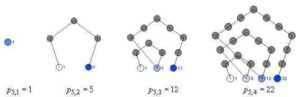
The diagram above (known as the tetractys) shows the first four triangular numbers (1, 3, 6, 10, …). Although there is a simple formula for calculating these numbers directly, t(n) = 1/2(n(n+1)), constructing them by these layered-triangle diagrams helps to show their geometric and recursive properties.

More generally, polygonal numbers arise from counting arrangements of dots in regular polygonal patterns. Larger polygons are built from smaller ones of the same type by adding additional layers of dots, called gnomons. Beginning with a single dot, k-sided polygons are built by adding gnomons consisting of k-2 segments, with each segment of the gnomon having one more dot than the segments of the previous layer. In this way, the nth gnomon consists of segments each n dots long, but with k-3 dots shared by adjoining segments (the corners).

This post describes how you can draw figures that illustrate the polygonal numbers and explore the polygonal numbers in general (triangular, square, pentagonal, hexagonal, etc.) using either TinkerPlots or Fathom. Both TinkerPlots and Fathom work well, but TinkerPlots creates nicer pictures, and allows for captions directly on the graph.
Without describing the details of how you create Fathom or TinkerPlot documents, here are the attributes that you will want to define in order to draw diagrams like the ones shown.

Required attributes
Create a slider k. This will allow you to set what kind of polygonal number you want to draw (k=3 gives triangular numbers, k=4 gives square numbers, etc.)
Define the following attributes:

n The number itself. This is a natural number beginning at 1 and continuing through the number of cases.

gnomon This states which “layer” or gnomon the number belongs in. It is calculated based on a number of other attributes.

g_index This is the position of the number within the gnonom – it ranges from 1 up until the next k-polygonal number is hit.

s_index Each gonom is broken up into sections or sides – what is the position within the side? Each side is of length equal to the gonom number. The first gonom has sides of length 1, the second has length 2, etc.

corner This keeps track of whether or not the number is a “corner” or not. This is based primarily on the s_index attribute.

c_index This keeps track of how many corners we have so far. There are only k-1 corners in a gnomon (the first number n=1 is the remaining corner). So, when we hit the last corner, we know we are at a polygonal number.

k_poly Records whether or not the number n is k-polygonal. It does this by checking to see if it is the last corner of a gnonom.
The attributes listed above are required for finding the position of each number within the figure; th following attributes are used in actually drawing the figures.

angle The base corner angle for the polygon is determined by k. This is the external angle for each corner.

current_angle We have to add to the base angle at each corner as we turn at each corner. This attribute is used to keep track of the total current angle.

dx This is the x-component of the unit direction vector that we are travelling in. Each new dot moves one dx over in the x-direction. It is given by the cosine of the current angle.

dy This is the y-component of the unit direction vector that we are travelling in. Each new dot moves one dy over in the y-direction. It is given by the sine of the current angle.

prev_g_1_x This is the x-coordinate of the first dot in the previous gonom layer. We need to know this because it will be the starting point for the next layer – each layer starts back at the “beginning” of the figure.

prev_g_1_y This is the y- coordinate of the first dot in the previous gonom layer.

x This is the x-coordinate of the current dot, calculated either from the previous dot or from the first dot in the previous layer.

y This is the y-coordinate of the current dot, calculated either from the previous dot or from the first dot in the previous layer.

caption Used to display the number on the plot (TinkerPlots only)
Below are the formulas for each attribute, written in “ascii” math. They are presented without a full explanation, in the hopes that if you try to implement this you will think about and explore each using the formulas and the descriptions above as a guide. Alternate methods for drawing the diagrams are possible, and you might find other formulas that achieve the same goals. Note that there are nested if() statements in several formulas.

n = caseIndex

gnomon = if(n=1){1, if(prev(k_poly)){prev(gnomon)+1, prev(gnomon)

g_index = if(n=1){ 1, if(prev(k_poly){1, prev(g_index) +1

s_index = if(n=1){ 1, if(prev(k_poly){1, if(prev(s_index) = gnomon){2,prev(s_index)

corner = (s_index=1) or (s_index=gnomon)

c_index= if(g_index=1){1, if(corner){prev(c_index)+1, prev(c_index)

k_poly = if(n=1){true, (c_index=k-1)

prev_g_1_x = if (n=1){0, if(g_index=2){prev(x), prev(prev_g_1_x)

prev_g_1_y = if(n=1){0, if(g_index=2){prev(y), prev(prev_g_1_y)

angle = pi-((k-2)*(pi/k))

current_angle = if(g_index =1) {pi-angle, if(pref(corner)){prev(current_angle)-angle, prev(current_angle)

dx = cos(current_angle)

dy = sin(current_angle)

x= if(n=1){0, if(g_index=1){prev_g_1_x +dx, prev(x) +dx

y =if(n=1){0, if(g_index=1){prev_g_1_y +dy, prev(y) +dy

caption = if(k_poly){n,””

To actually draw the diagrams, create a new plot with the x and y attributes as the horizontal and vertical axis, respectively. Add cases to the collection to populate the diagram. Optionally you can show connecting lines, and (in TinkerPlots) add a legend using the caption attribute.

For more such insights, log into www.international-maths-challenge.com.

*Credit for article given to dan.mackinnon*