How Spiral Search Patterns And Lateral Thinking Cracked Our Puzzle

Rob Eastaway and Brian Hobbs take over our maths column to reveal who solved their puzzle and won a copy of their New Scientist puzzle book, Headscratchers.

When solving problems in the real world, it is rare that the solution is purely mathematical, but maths is often a key ingredient. The puzzle we set a few weeks ago (New Scientist, 30 September, p 45) embraced this by encouraging readers to come up with ingenious solutions that didn’t have to be exclusively maths-based.

Here is a reminder of the problem: Prince Golightly found himself tied to a chair near the centre of a square room, in the dark, with chained monsters in the four corners and an escape door in the middle of one wall. With him, he had a broom, a dictionary, some duct tape, a kitchen clock and a bucket of water with a russet fish.

John Offord was one of several readers to spot an ambiguity in our wording. Four monsters in each corner? Did this mean 16 monsters? John suggested the dictionary might help the captors brush up on their grammar.

The russet fish was deliberately inserted as a red herring (geddit?), but we loved that some readers found ways to incorporate it, either as a way of distracting the monsters or as a source of valuable protein for a hungry prince. Dave Wilson contrived a delightful monster detector, while Glenn Reid composed a limerick with the solution of turning off the computer game and going to bed.

And so to more practical solutions. Arlo Harding and Ed Schulz both suggested ways of creating a torch by igniting assorted materials with an electric spark from the light cable. But Ben Haller and Chris Armstrong had the cleverest mathematical approach. After locating the light fitting in the room’s centre with the broom, they used duct tape and rope to circle the centre, increasing the radius until they touched the wall at what must be its centre, and then continued circling to each wall till they found the escape door. Meanwhile, the duo of Denise and Emory (aged 11) used Pythagoras’s theorem to confirm the monsters in the corners would be safely beyond reach. They, plus Ben and Chris, win a copy of our New Scientist puzzle book Headscratchers.

It is unlikely you will ever have to escape monsters in this way, but spiral search patterns when visibility is limited are employed in various real-world scenarios: rescuers probing for survivors in avalanches, divers performing underwater searches and detectives examining crime scenes, for example. Some telescopes have automated spiral search algorithms that help locate celestial objects. These patterns allow for thorough searches while ensuring you don’t stray too far from your starting point.

Of course, like all real-world problems, mathematical nous isn’t enough. As our readers have displayed, lateral thinking and the ability to improvise are human skills that help us find the creative solutions an algorithm would miss.

For more such insights, log into www.international-maths-challenge.com.

*Credit for article given to Rob Eastaway and Brian Hobbs*


Here’s why you should (almost) never use a pie chart for your data

Our lives are becoming increasingly data driven. Our phones monitor our time and internet usage and online surveys discern our opinions and likes. These data harvests are used for telling us how well we’ve slept or what we might like to buy.

Numbers are becoming more important for everyday life, yet people’s numerical skills are falling behind. For example, the percentage of Year 12 schoolchildren in Australia taking higher and intermediate mathematics has been declining for decades.

To help the average person understand big data and numbers, we often use visual summaries, such as pie charts. But while non-numerate folk will avoid numbers, most numerate folk will avoid pie charts. Here’s why.

What is a pie chart?

A pie chart is a circular diagram that represents numerical percentages. The circle is divided into slices, with the size of each slice proportional to the category it represents. It is named because it resembles a sliced pie and can be “served” in many different ways.

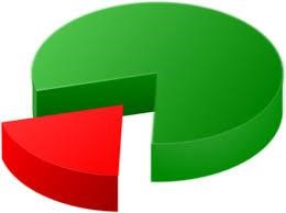
An example pie chart below shows Australia’s two-party preferred vote before the last election, with Labor on 55% and the the Coalition on 45%. The two near semi-circles show the relatively tight race—this is a useful example of a pie chart.

What’s wrong with pie charts?

Once we have more than two categories, pie charts can easily misrepresent percentages and become hard to read.

The three charts below are a good example—it is very hard to work out which of the five areas is the largest. The pie chart’s circularity means the areas lack a common reference point.

Pie charts also do badly when there are lots of categories. For example, this chart from a study on data sources used for COVID data visualization shows hundreds of categories in one pie.

The tiny slices, lack of clear labeling and the kaleidoscope of colors make interpretation difficult for anyone.

It’s even harder for a color blind person. For example, this is a simulation of what the above chart would look like to a person with deuteranomaly or reduced sensitivity to green light. This is the most common type of color blindness, affecting roughly 4.6% of the population.

It can get even worse if we take pie charts and make them three-dimensional. This can lead to egregious misrepresentations of data.

Below, the yellow, red and green areas are all the same size (one-third), but appear to be different based on the angle and which slice is placed at the bottom of the pie.

So why are pie charts everywhere?

Despite the well known problems with pie charts, they are everywhere. They are in journal articles, Ph.D. theses, political polling, books, newspapers and government reports. They’ve even been used by the Australian Bureau of Statistics.

While statisticians have criticized them for decades, it’s hard to argue with this logic: “If pie charts are so bad, why are there so many of them?”

Possibly they are popular because they are popular, which is a circular argument that suits a pie chart.

What’s a good alternative to pie charts?

There’s a simple fix that can effectively summarize big data in a small space and still allow creative color schemes.

It’s the humble bar chart. Remember the brain-aching pie chart example above with the five categories? Here’s the same example using bars—we can now instantly see which category is the largest.

Linear bars are easier on the eye than the non-linear segments of a pie chart. But beware the temptation to make a humble bar chart look more interesting by adding a 3D effect. As you already saw, 3D charts distort perception and make it harder to find a reference point.

Below is a standard bar chart and a 3D alternative of the number of voters in the 1992 US presidential election split by family income (from under US$15K to over $75k). Using the 3D version, can you tell the number of voters for each candidate in the highest income category? Not easily.

Is it ever okay to use a pie chart?

We’ve shown some of the worst examples of pie charts to make a point. Pie charts can be okay when there are just a few categories and the percentages are dissimilar, for example with one large and one small category.

Overall, it is best to use pie charts sparingly, especially when there is a more “digestible” alternative—the bar chart.

Whenever we see pie charts, we think one of two things: their creators don’t know what they’re doing, or they know what they are doing and are deliberately trying to mislead.

A graphical summary aims to easily and quickly communicate the data. If you feel the need to spruce it up, you’re likely reducing understanding without meaning to do so.

For more such insights, log into our website https://international-maths-challenge.com

Credit of the article given to Adrian Barnett and Victor Oguoma, The Conversation